---
title: "Bayesian Additive Regression Trees (BART)"
share:
permalink: "https://book.martinez.fyi/bart.html"
description: "Business Data Science: What Does it Mean to Be Data-Driven?"
linkedin: true
email: true
mastodon: true
---
## BART: Bayesian Additive Regression Trees
BART is a Bayesian nonparametric, machine learning, ensemble predictive modeling
method introduced by @chipman2010bart. It can be expressed as:
$$
Y = \sum_{j=1}^m g(X; T_j, M_j) + \epsilon, \quad \epsilon \sim N(0, \sigma^2)
$$
where $g(X; T_j, M_j)$ represents the $j$-th regression tree with structure
$T_j$ and leaf node parameters $M_j$. The model uses $m$ trees, typically set to
a large number (e.g., 200), with each tree acting as a weak learner. BART
employs a carefully designed prior that encourages each tree to play a small
role in the overall fit, resulting in a flexible yet robust model.
@hill2011bayesian proposed using BART for causal inference, recognizing its
unique advantages in this context. BART is particularly well-suited for causal
inference due to its ability to:
1. Capture complex, nonlinear relationships without requiring explicit
specification
2. Automatically model interactions between variables
3. Handle high-dimensional data effectively
4. Provide uncertainty quantification through its Bayesian framework
These features make BART especially valuable in observational studies with many
covariates, where the true functional form of the relationship between variables
is often unknown.
The key idea was to use BART to model the response surface:
$$
E[Y | X, Z] = f(X, Z)
$$
where $Y$ is the outcome, $X$ are the covariates, and $Z$ is the treatment
indicator. The causal effect can then be estimated as:
$$
\begin{aligned}
\tau(x) & = E[Y | X=x, Z=1] - E[Y | X=x, Z=0] \\
& = f(x, 1) - f(x, 0)
\end{aligned}
$$
This formulation leverages BART's inherent ability to automatically capture
intricate interactions and non-linear relationships, making it a potent tool for
causal inference, especially in high-dimensional scenarios.
The effectiveness of BART in causal inference has been further validated in
recent competitions. @thal2023causal report on the 2022 American Causal
Inference Conference (ACIC) data challenge, where BART-based methods were among
the top performers, particularly for estimating heterogeneous treatment effects.
They found that BART's regularizing priors were especially effective in
controlling error for subgroup estimates, even in small subgroups, and its
flexibility in modeling confounding relationships was crucial for improved
causal inference in complex scenarios.
## Example with a Single Covariate
To illustrate how BART can be used for estimating the impact of an intervention,
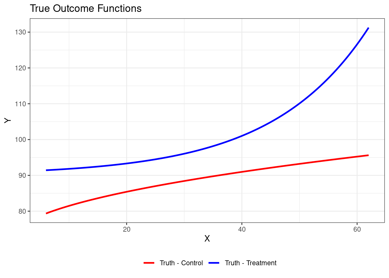
@hill2011bayesian presents a simple example:
$$
\begin{aligned}
Z &\sim \mbox{Bernoulli}(0.5) \\
X | Z = 1 &\sim N(40,10^2) \\
X | Z = 0 &\sim N(20,10^2) \\
Y(0) | X &\sim N(72 + 3\sqrt{X},1) \\
Y(1) | X &\sim N(90 + exp(0.06X),1)
\end{aligned}
$$
```{r truth, message=FALSE, warning=FALSE}
library(ggplot2)
library(dplyr)
library(broom)

# 1. Define True Outcome Functions
f_treated <- function(x) 90 + exp(0.06 * x)
f_control <- function(x) 72 + 3 * sqrt(x)

# 2. Visualize True Outcome Functions
ggplot(data.frame(x = 6:62), aes(x = x)) +  # Expanded x range for clarity
  stat_function(fun = f_control, aes(color = "Truth - Control"), linewidth = 1) +
  stat_function(fun = f_treated, aes(color = "Truth - Treatment"), linewidth = 1) +
  scale_color_manual(values = c("red", "blue")) +
  labs(title = "True Outcome Functions", x = "X", y = "Y", color = "") +
  theme_bw() +
  theme(legend.position = "bottom")
```
We can generate a sample from that data generating process as follows:
```{r sample, warning=FALSE, message=FALSE}
set.seed(123)
n_samples <- 120

simulated_data <- tibble(
  treatment_group = sample(c("Treatment", "Control"), size = n_samples, replace = TRUE),
  is_treated = treatment_group == "Treatment",
  X = if_else(is_treated, rnorm(n_samples, 40, 10), rnorm(n_samples, 20, 10)),
  Y1 = rnorm(n_samples, mean = f_treated(X), sd = 1),
  Y0 = rnorm(n_samples, mean = f_control(X), sd = 1),
  Y = if_else(is_treated, Y1, Y0),
  true_effect = Y1 - Y0
)


# 4. Visualize Simulated Data with True Functions
ggplot(simulated_data, aes(x = X, y = Y, color = treatment_group)) +
  geom_point(size = 2) +
  stat_function(fun = f_control, aes(color = "Truth - Control")) +
  stat_function(fun = f_treated, aes(color = "Truth - Treatment")) +
  scale_color_manual(values = c("Truth - Control" = "red", "Truth - Treatment" = "blue")) +
  labs(title = "Simulated Data with True Outcome Functions",
       x = "X", y = "Y", color = "") +
  theme_bw() +
  theme(legend.position = "bottom")
cat(glue::glue("The true Sample Average Treatment Effect is {round(mean(simulated_data$true_effect),2)}"))
```
Notice that in our sample, there is not very good overlap for low and high
values of X. This means that we will have to do a lot of extrapolation when
doing inference for those cases, which is a common challenge in causal
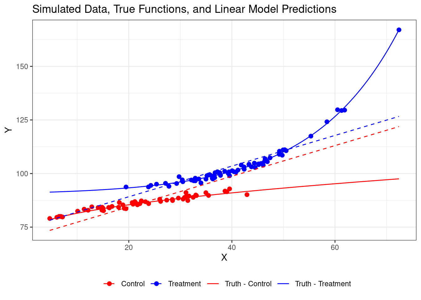
inference. Now, suppose we just fit OLS to the model to try to estimate the
average treatment effect:
```{r ols}
linear_model <- lm(Y ~ X + is_treated, data = simulated_data)
lm_fit <- broom::tidy(linear_model)
lm_fit
cat(glue::glue("A linear model finds an Average Treatment Effect equal to {round(lm_fit$estimate[lm_fit$term=='is_treatedTRUE'],2)}"))
```
It's important to note that the linear model is misspecified given the true
nonlinear relationships, which contributes to its poor performance. Let's add
the findings from OLS to our plot:
```{r ols_plot, warning=FALSE}
prediction_data <- expand.grid(
  X = seq(min(simulated_data$X), max(simulated_data$X), length.out = 1000),
  is_treated = c(TRUE, FALSE)
) %>%
  mutate(
    treatment_group = if_else(is_treated, "Treatment", "Control"),
    linear_prediction = predict(linear_model, newdata = .)
  )

# 6. Visualize Simulated Data, True Functions, and Linear Predictions
ggplot() +
  geom_point(data = simulated_data, aes(x = X, y = Y, color = treatment_group), size = 2) +
  stat_function(fun = f_control, aes(color = "Truth - Control")) +
  stat_function(fun = f_treated, aes(color = "Truth - Treatment")) +
  geom_line(data = prediction_data, aes(x = X, y = linear_prediction,
                                        color = treatment_group), linetype = "dashed") +
  scale_color_manual(values = c("Truth - Control" = "red",
                                "Truth - Treatment" = "blue",
                                "Control" = "red",
                                "Treatment" = "blue")) +
  labs(title = "Simulated Data, True Functions, and Linear Model Predictions",
       x = "X", y = "Y", color = "") +
  theme_bw() +
  theme(legend.position = "bottom")
```
To fit BART we can use the [{stochtree}](https://stochtree.ai/) package.
```{r fit_bart, warning=FALSE, message=FALSE}
xstart <- 20-15
length <- 4
text_left <- 26-15
yVals <- seq(110,130,by=4)

X_train <- simulated_data %>%
                    select(X, is_treated) %>%
                    as.matrix()

X_test <- prediction_data %>%
                    select(X, is_treated) %>%
                    as.matrix()

bart_model <-
  stochtree::bart(X_train = X_train,
                  X_test = X_test,
                  y_train = simulated_data$Y,
                  num_burnin = 1000,
                  num_mcmc = 2000)
```
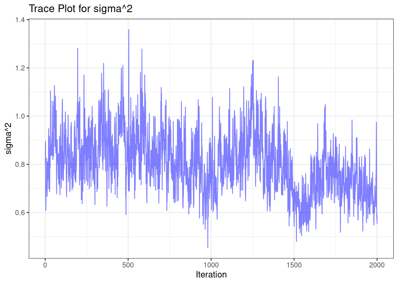
After fitting, it is important to examine the traceplot of $\sigma^2$ to assess
if the model has converged. We can do this by running the following code:
```{r traceplot}
trace_plot_data <-
  tibble(
    iteration = 1:length(bart_model$sigma2_global_samples),
    sigma2_samples = bart_model$sigma2_global_samples
  )
ggplot(aes(x = iteration, y = sigma2_samples), data = trace_plot_data) +
  geom_line(color = "blue", alpha = 0.5) +
  labs(title = "Trace Plot for sigma^2",
       x = "Iteration",
       y = "sigma^2") +
  theme_bw()
```
When assessing convergence using the trace plot, look for the following:
1. Stationarity: The values should fluctuate around a constant mean level.
2. No trends: There should be no obvious upward or downward trends.
3. Quick mixing: The chain should move rapidly through the parameter space.
4. No stuck periods: There should be no long periods where the chain stays at
the same value.
In this case, the trace plot suggests good convergence, as it exhibits these
desirable properties.
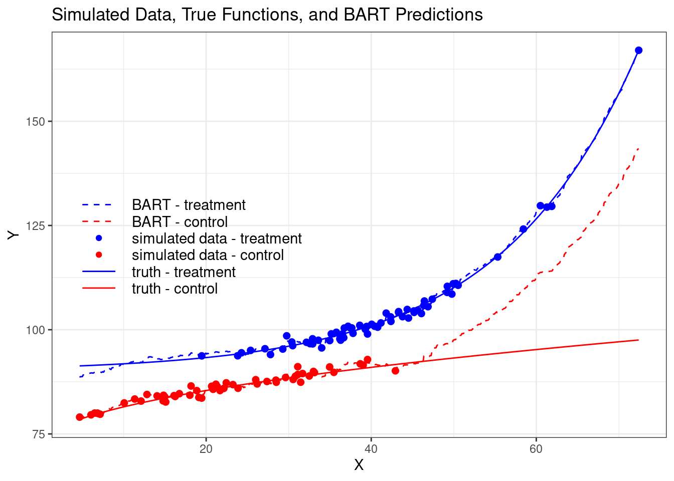
Now we can plot the predictions from BART and compare them to the truth with the
following code:
```{r bart_plot}
prediction_data <- prediction_data %>%
  mutate(bart_pred = rowMeans(bart_model$y_hat_test))


ggplot() +
  geom_point(data = simulated_data,
             aes(x = X, y = Y, color = treatment_group),
             size = 2) +
  stat_function(fun = f_control, aes(color = "Truth - Control")) +
  stat_function(fun = f_treated, aes(color = "Truth - Treatment")) +
  scale_color_manual(
    values = c(
      "Truth - Control" = "red",
      "Truth - Treatment" = "blue",
      "Control" = "red",
      "Treatment" = "blue"
    )
  ) +
  labs(
    title = "Simulated Data, True Functions, and BART Predictions",
    x = "X",
    y = "Y",
    color = ""
  ) +
  theme_bw() +
  theme(legend.position = "none") +
  geom_line(data = prediction_data,
            aes(x = X, y = bart_pred, color = treatment_group),
            linetype = "dashed") +
   scale_color_manual("", values = c("red", "blue","red", "blue", "red", "blue", "red", "blue")) +
   annotate(geom = "segment", x = xstart, y = yVals[1], xend = xstart+length, yend = yVals[1], color = "red") +
   annotate(geom = "text", x = text_left, y = yVals[1], label = c("truth - control"), hjust = 0) +
   annotate(geom = "segment", x = xstart, y = yVals[2], xend = xstart+length, yend = yVals[2], color = "blue") +
   annotate(geom = "text", x = text_left, y = yVals[2], label = c("truth - treatment"), hjust = 0) +
   geom_point(aes(x=xstart+length/2, y=yVals[3]), color = c("red")) +
   annotate(geom = "text", x = text_left, y = yVals[3], label = c("simulated data - control"), hjust = 0) +
   geom_point(aes(x=xstart+length/2, y=yVals[4]), color = c("blue")) +
   annotate(geom = "text", x = text_left, y = yVals[4], label = c("simulated data - treatment"), hjust = 0) +
   annotate(geom = "segment", x = xstart, y = yVals[5], xend = xstart+length, yend = yVals[5], color = "red", linetype = "dashed") +
   annotate(geom = "text", x = text_left, y = yVals[5], label = c("BART - control"), hjust = 0) +
   annotate(geom = "segment", x = xstart, y = yVals[6], xend = xstart+length, yend = yVals[6], color = "blue", linetype = "dashed") +
   annotate(geom = "text", x = text_left, y = yVals[6], label = c("BART - treatment"), hjust = 0)
```
Notice that BART does a very good job when we have overlap between the treatment
and control groups, but when extrapolating for high values of X, BART cannot get
the true control curve right because it has no data in that region. This
highlights the importance of understanding how any method works.
Once we have fitted the BART model, we can calculate the sample average
treatment effect by predicting the outcome for every individual in our sample
under both treatment and control conditions. The difference between these
predictions gives us the posterior distribution of the treatment effect for each
individual. The sample average treatment effect is then the mean of this
posterior distribution.
```{r bart_sate}
x0 <- simulated_data %>% mutate(is_treated=FALSE) %>% select(X,is_treated)
x1 <- simulated_data %>% mutate(is_treated=TRUE) %>% select(X,is_treated)

pred0 <- predict(bart_model, as.matrix(x0))

pred1 <- predict(bart_model, as.matrix(x1))

tau_draws <- pred1$y_hat - pred0$y_hat
sate_draws <- colMeans(tau_draws)
cat(glue::glue("BART finds an Average Treatment Effect equal to {round(mean(sate_draws),2)}"))
```
However, as we discussed before, point estimates are often not very useful for
decision-making. For instance, we might make different decisions if the impact
of the intervention is more than 9, between 0 and 9, or less than 0. Calculating
probabilities for different effect sizes is more useful for decision-making than
point estimates alone because it provides a more nuanced understanding of the
potential outcomes and the uncertainty associated with our estimates.
::: {.content-visible when-format="pdf"}
We can easily calculate these probabilities using the draws from the posterior
probability that we just calculated.
:::
::: {.content-visible when-format="html"}
We can easily calculate these probabilities using the posterior draws and visualize
them:
```{r bart_viz}
#| eval: !expr knitr::is_html_output()
vizdraws::vizdraws(
  posterior = sate_draws,
  breaks = c(0, 9),
  break_names = c("Discontinue", "Continue", " Expand")
)
```
:::
## More Covariates and Propensity Score
Let's extend our exploration of BART by incorporating multiple covariates and a
propensity score. This scenario more closely resembles real-world causal
inference problems, where we often deal with multiple confounding variables and
complex relationships between covariates, treatment, and outcomes.
Consider a scenario with an outcome of interest, $y$, a binary treatment
indicator, $z$, and three covariates, $x_1$, $x_2$, and $x_3$, related as
follows:
$$
y \sim N(\mu(x_1,x_2) + z \tau(x_2,x_3), \sigma)
$$
Here, $\mu(x_1,x_2)$ represents the prognostic function (the expected outcome in
the absence of treatment), and $\tau(x_2,x_3)$ represents the treatment effect
function. This setup allows for heterogeneous treatment effects that depend on
$x_2$ and $x_3$.
```{r fake_data2}
library(dplyr)
library(tidyr)

set.seed(1982)
n <- 1000

my_df <- tibble(
    x1 = rnorm(n),
    x2 = rnorm(n),
    x3 = rnorm(n)
  ) %>%
  mutate(
    mu = if_else(x1 > x2, -0.9, 1.1),
    pi = pnorm(mu),
    z = rbinom(n, 1, pi),
    tau = 1 / (1 + exp(-x3)) + x2 / 10,
    y = rnorm(n, mean = mu + z * tau, sd = 0.4)
  )

glimpse(my_df)
```
In this data generating process, we've introduced confounding by making the
treatment assignment ($z$) depend on the prognostic function ($\mu$). This
creates a challenge for causal inference, as differences in outcomes between
treated and control groups will be due to both the treatment effect and the
confounding.
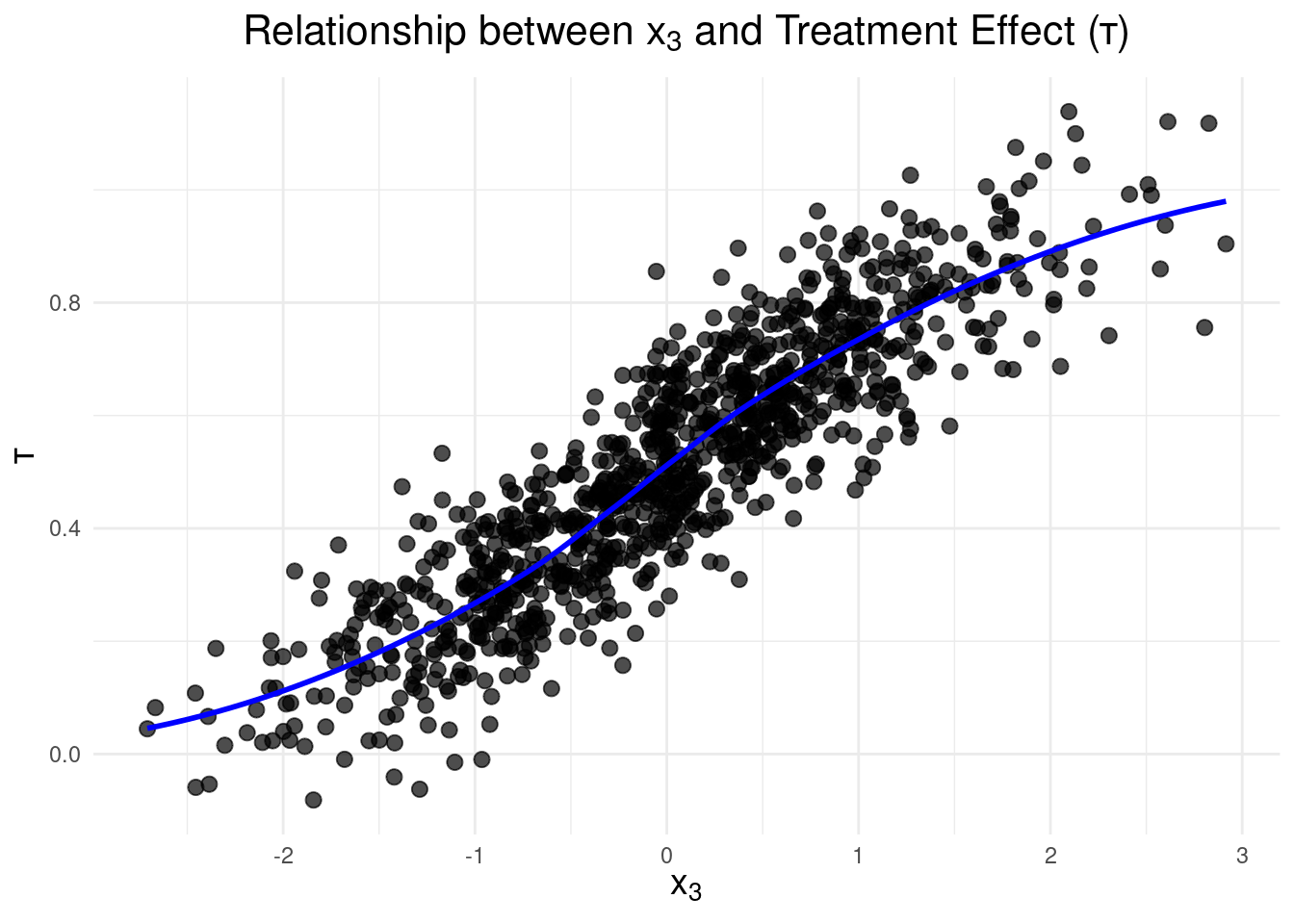
To gain insights into the relationship between $x_3$ and the treatment effect,
$\tau$, let's visualize it:
```{r plot2, message=FALSE, warning=FALSE}
ggplot(data = my_df, aes(x = x3, y = tau)) +
  geom_point(size = 2.5, alpha = 0.7) +
  geom_smooth(
    method = "loess",
    se = FALSE,
    color = "blue",
    linewidth = 1
  ) +
  xlab(expression(x[3])) +
  ylab(expression(tau)) +
  ggtitle(expression(
    paste("Relationship between ", x[3], " and Treatment Effect (", tau, ")")
  )) +
  theme_minimal() +
  theme(
    axis.title = element_text(size = 14, face = "bold"),
    plot.title = element_text(size = 16, hjust = 0.5)
  )
```
::: {.callout-note}
## Tip
When using BART for causal inference, it's important to include the propensity
score as an additional covariate. The propensity score represents the
probability of being in the treatment group given the covariates. Including it
can improve the accuracy of treatment effect estimation, especially in scenarios
with strong confounding.
Empirical research, such as that by @hahn2020bayesian, has shown that including
the propensity score helps mitigate a phenomenon called "Regularization-Induced
Confounding" (RIC). RIC can occur when flexible machine learning methods like
BART are applied to causal inference problems with strong confounding. By
including the propensity score, we give the model an additional tool to
distinguish between the effects of confounding and the true treatment effect.
:::
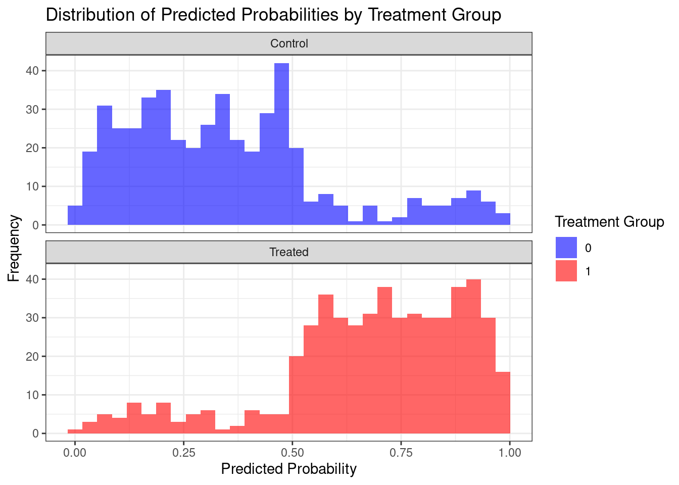
We can estimate the propensity score using a Bayesian generalized linear model
(GLM):
```{r}
# Fit Bayesian GLM
ps_model <- arm::bayesglm(z ~ x1 + x2 + x3,
                    family = binomial(),
                    data = my_df)

# Calculate Predicted Probabilities
my_df <- my_df %>%
  mutate(ps = predict(ps_model, type = "response"))

# Plot Histogram of Predicted Probabilities
ggplot(my_df, aes(x = ps, fill = factor(z))) +
  geom_histogram(alpha = 0.6, position = "identity", bins = 30) +
  facet_wrap(~ z, ncol = 1, labeller = labeller(z = c("0" = "Control", "1" = "Treated"))) +
  labs(title = "Distribution of Predicted Probabilities by Treatment Group",
       x = "Predicted Probability",
       y = "Frequency",
       fill = "Treatment Group") +
  theme_bw() +
  scale_fill_manual(values = c("0" = "blue", "1" = "red"))
```
This plot reveals the degree of overlap in propensity scores between the treated
and control groups. Good overlap is crucial for reliable causal inference. Areas
where there's little overlap between the treated and control groups may lead to
less reliable estimates of treatment effects.
Now we can fit our BART model, including the estimated propensity score
alongside our original covariates:
```{r fit_bart2}
X_train <- my_df %>%
   select(x1, x2, x3, ps, z) %>%
  as.matrix()

bart_model <-
  stochtree::bart(X_train = X_train,
                  y_train = my_df$y,
                  num_burnin = 1000,
                  num_mcmc = 2000)
```
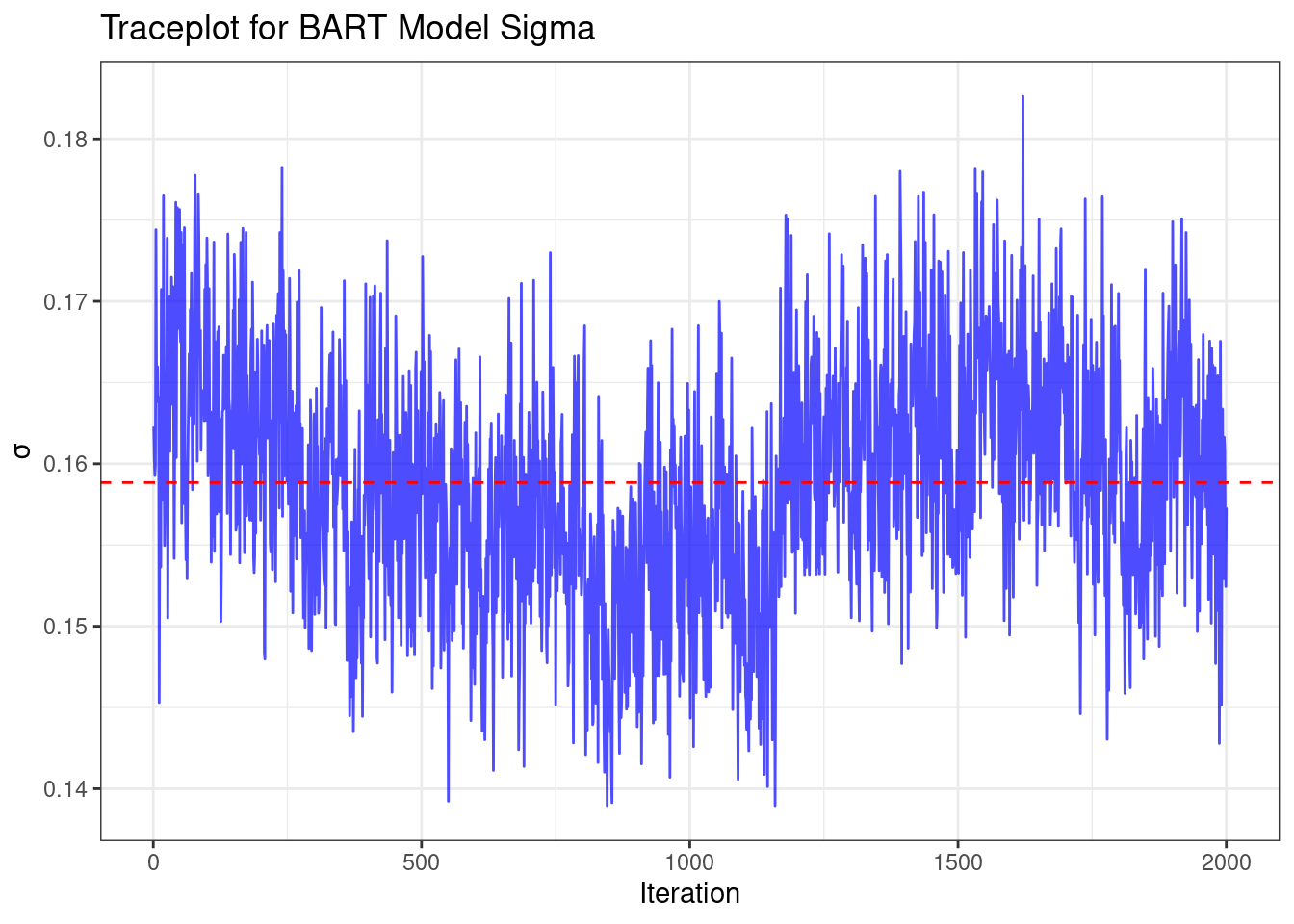
After fitting, let's examine the trace plot of $\sigma^2$ to assess convergence:
```{r}
# Create the Data for Plotting
df_plot <- tibble(
  iteration = seq_along(bart_model$sigma2_global_samples),    # Sequence of iteration numbers
  sigma = bart_model$sigma2_global_samples
)

# Create the Traceplot
ggplot(data = df_plot, aes(x = iteration, y = sigma)) +
  geom_line(color = "blue", alpha = 0.7) +
  labs(title = "Traceplot for BART Model Sigma",
       x = "Iteration",
       y = expression(sigma)) +
  theme_bw() +
  geom_hline(yintercept = mean(df_plot$sigma), linetype = "dashed", color = "red")
```
This trace plot shows the values of $\sigma$ across MCMC iterations. We're
looking for a relatively stationary pattern without any clear trends, which
would indicate good convergence. The red dashed line represents the mean value
of $\sigma$.
We can also assess the effective sample size (ESS) to gauge the efficiency of
the sampling process:
```{r}
library(coda)

# Calculate Effective Sample Size (ESS)
ess_sigma <- effectiveSize(df_plot$sigma)

# Display the Result (with formatting)
cat("Effective Sample Size (ESS) for sigma:", format(ess_sigma, big.mark = ","), "\n")
```
The ESS tells us how many independent samples our MCMC chain is equivalent to. A
higher ESS indicates more efficient sampling and more reliable posterior
estimates.
Now, let's calculate the estimated average treatment effect using BART:
```{r}
x0 <- my_df %>%
   select(x1, x2, x3, ps, z) %>%
  mutate(z=0) %>% as.matrix()
x1 <- my_df %>%
   select(x1, x2, x3, ps, z) %>%
  mutate(z=1) %>% as.matrix()

pred0 <- predict(bart_model, as.matrix(x0))

pred1 <- predict(bart_model, as.matrix(x1))

tau_draws <- pred1$y_hat - pred0$y_hat
sate_draws <- colMeans(tau_draws)
cat(glue::glue("BART finds an Average Treatment Effect equal to {round(mean(sate_draws),2)}"))
cat(glue::glue("The truth Average Treatment Effect is equal to {round(mean(my_df$tau),2)}"))
```
::: {.callout-note}
## Tip
A key advantage of BART is its ability to estimate treatment effects at the
individual level. While these individual estimates can be noisy, they can be
useful for exploring potential treatment effect heterogeneity. One way to do
this is by using a classification and regression tree (CART) model on the
estimated individual treatment effects:
:::
```{r}
library(rpart)
library(rpart.plot)
my_df <- my_df %>%
mutate(tau_hat = rowMeans(tau_draws)) # point estimate of the individual's treatment effect
# Fit the Tree Model (Using Cross-Validation)
tree_model <- rpart(
tau_hat ~ x1 + x2 + x3,
data = my_df,
method = "anova",
control = rpart.control(cp = 0.05, xval = 10) # Cross-validation with 10 folds
)
# Find Optimal Complexity Parameter (CP)
optimal_cp <- tree_model$cptable[which.min(tree_model$cptable[, "xerror"]), "CP"]
# Prune the Tree for Better Generalization
pruned_tree <- prune(tree_model, cp = optimal_cp)
# Plot the Pruned Tree
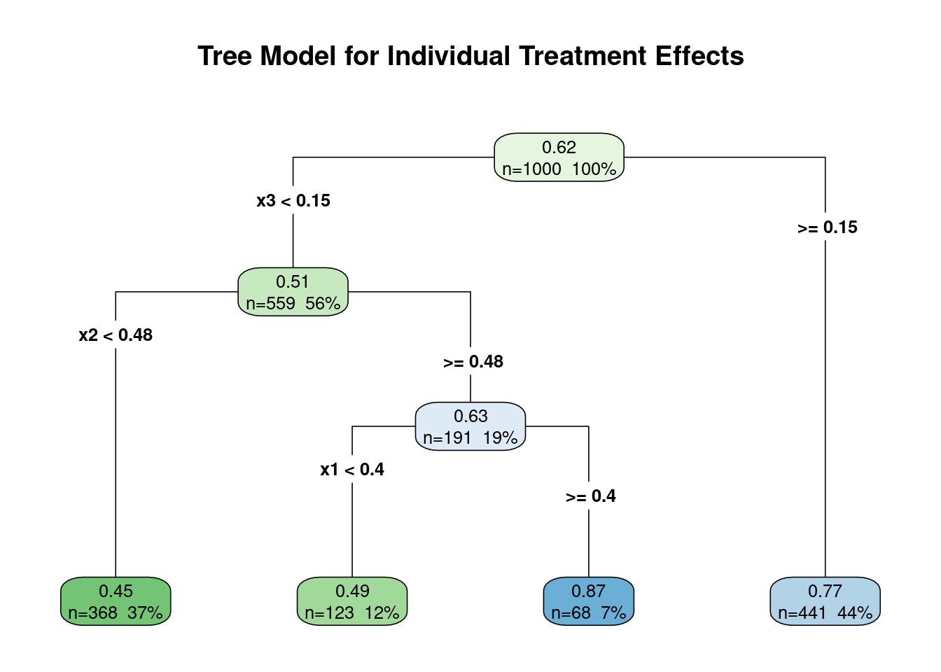
rpart.plot(pruned_tree,
type = 4, extra = 101,
fallen.leaves = TRUE,
main = "Tree Model for Individual Treatment Effects",
cex = 0.8,
box.palette = "GnBu")
# Print the Pruned Tree Summary
printcp(pruned_tree)  # See the results of pruning
```
In our analysis, the CART model successfully identified $x_3$ as the primary
driver of treatment effect heterogeneity, aligning with the way we generated our
data. However, it's crucial to exercise caution when interpreting these results:
1. CART models do not inherently account for uncertainty. The splits in the
tree are based on point estimates and don't reflect the uncertainty in our
treatment effect estimates.
2. The tree structure can be sensitive to small changes in the data. Different
samples might yield different trees, even if the underlying relationships
are the same.
3. While CART pinpointed $x_3$ as the key modifier, it also suggests that $x_1$
is a modifier, which we know is not correct in our simulated data. This
illustrates how CART can sometimes identify spurious relationships.
To gain a more nuanced understanding of treatment effect heterogeneity, we
should leverage the full posterior distribution of treatment effects obtained
from BART. This allows us to quantify our uncertainty about heterogeneous
effects and avoid overinterpreting potentially spurious findings from methods
like CART.
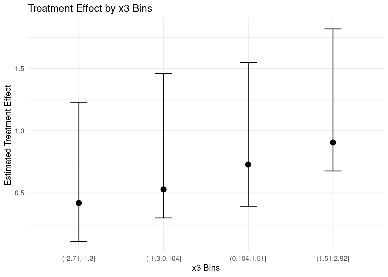
For example, we could examine how the posterior distribution of treatment
effects varies across different levels of $x_3$:
```{r byx3}
# Create bins for x3
my_df <- my_df %>%
  mutate(x3_bin = cut(x3, breaks = 4))

# Calculate mean and credible intervals for each bin
tau_summary <- my_df %>%
  group_by(x3_bin) %>%
  summarise(
    mean_tau = mean(tau_hat),
    lower_ci = quantile(tau_hat, 0.025),
    upper_ci = quantile(tau_hat, 0.975)
  )

# Plot
ggplot(tau_summary, aes(x = x3_bin, y = mean_tau)) +
  geom_point(size = 3) +
  geom_errorbar(aes(ymin = lower_ci, ymax = upper_ci), width = 0.2) +
  labs(title = "Treatment Effect by x3 Bins",
       x = "x3 Bins",
       y = "Estimated Treatment Effect") +
  theme_minimal()
```
This plot gives us a more robust view of how the treatment effect varies with
$x_3$, including our uncertainty about these effects. We can see that the
treatment effect generally increases with $x_3$, but there's considerable
uncertainty
In conclusion, while BART provides powerful tools for estimating heterogeneous
treatment effects, it's crucial to combine these estimates with careful
consideration of uncertainty and potential confounding. By doing so, we can gain
valuable insights into how treatment effects vary across different subgroups,
while avoiding overconfident or spurious conclusions.
::: {.callout-tip}
## Learn more
@hill2011bayesian Bayesian nonparametric modeling for causal inference.
:::
## Accelerated BART (XBART)
While BART has proven to be a powerful tool for causal inference, its
computational demands can be significant, especially with large datasets. To
address this, @he2019xbart introduced Accelerated BART (XBART), a method that
maintains the flexibility and effectiveness of BART while substantially reducing
computation time.
XBART uses a stochastic tree-growing algorithm inspired by Bayesian updating,
blending regularization strategies from Bayesian modeling with computationally
efficient techniques from recursive partitioning. The key difference is that
XBART regrows each tree from scratch at each iteration, rather than making small
modifications to existing trees as in standard BART. The XBART algorithm
proceeds as follows:
1. At each node, calculate the probability of splitting at each possible
cutpoint based on the marginal likelihood.
2. Sample a split (or no split) according to these probabilities.
3. If a split is chosen, recursively apply steps 1-2 to the resulting child
nodes.
4. If no split is chosen or stopping conditions are met, sample the leaf
parameter from its posterior distribution.
This approach allows XBART to efficiently explore the space of possible tree
structures, leading to faster convergence and reduced computation time compared
to standard BART.