---
title: "Study Design"
share:
permalink: "https://book.martinez.fyi/strength.html"
description: "Pilot Strength: Designing Decision-Centric Business Experiments"
linkedin: true
email: true
mastodon: true
---
As we discussed before, the most important thing when designing a study is to
start with the decision you are trying to inform, and craft the right business
questions that can be answered with data to inform that decision. Then, if you
are going to run an experiment to answer those questions you will have to think
about important details such as how big of an experiment should I run, what
should be the unit of randomization, what proportion should be assigned to each
arm, etc. To answer these questions most people use power calculations.
## Power Calculations in Experimental Design
In the context of experimental design, power is the probability of detecting an
effect if it truly exists. In other words, it's the likelihood of rejecting the
null hypothesis when it is false. Power is intrinsically linked to Type II error
(false negative), which is the probability of failing to reject the null
hypothesis when it is actually false. Power is calculated as $1 - \beta$, where
$\beta$ represents the probability of a Type II error.
Power analysis involves determining the minimum sample size needed to detect an
effect of a given size or determining the effect size that can be detected with
a given sample size. A key concept in power analysis is the Minimum Detectable
Effect (MDE), which is the smallest effect size that the study is designed to
detect with a specified level of statistical power. Power can be conceptualized
as a function of the signal-to-noise ratio in an experiment. The "signal" refers
to the effect size, while the "noise" represents the variability within the
data. A stronger signal and lower noise lead to higher power.
Traditional power analysis focuses on Type I and Type II errors. However, Gelman
and Carlin (2014) argue that these are insufficient to fully capture the risks
of null hypothesis significance testing (NHST). They propose considering Type S
(sign) and Type M (magnitude) errors:
- **Type S error:** The probability that a statistically significant result
has the opposite sign of the true effect. This can lead to incorrect
conclusions about the direction of an effect.
- **Type M error:** The factor by which a statistically significant effect
might be overestimated. This can lead to exaggerated claims about the size
of an effect.
These errors are particularly relevant in studies with small samples and noisy
data, where statistically significant results may be misleading. Gelman and
Carlin recommend design analysis, which involves calculating Type S and Type M
errors to assess the potential for these errors in a study design.
### Methods for Performing Power Calculations
There are different methods for performing power calculations:
- **Analytical methods:** These methods use formulas to calculate power or
sample size based on the factors mentioned above. For example, the formula
for calculating the sample size needed for a two-sample t-test can be found
in many statistical textbooks .
- **Simulation methods:** These methods involve generating random data and
performing statistical tests repeatedly to estimate power. They are
particularly useful for complex study designs where analytical formulas may
not be available or accurate.
### A Simple Example with the Analytical Method
Suppose we are thinking about running an experiment and our outcome of interest
is binary and only 5% of the outcomes take the value 1. For example, this could
be an experiment for reducing churn. Imagine we are testing a new intervention
aimed at reducing customer churn, and we want to understand how large of an
experiment we need to reliably detect a reduction in the churn rate if the
intervention is effective. Our baseline churn rate is 5%, meaning that without
any intervention, approximately 5% of customers churn.
We want to use an analytical method to perform a power calculation.
Specifically, we want to investigate how the Minimum Detectable Effect (MDE)
changes as we increase the sample size of our experiment. The MDE, in this
context, represents the smallest reduction in the churn rate that our experiment
is designed to detect with a given level of statistical power.
The R code below uses the `calculateMdes` function to compute the MDE for
different sample sizes (N), assuming we are conducting a two-sample t-test to
compare the churn rates between a treatment and a control group. We set the
significance level (`sig_lvl`) to 0.05 and the desired power (`power`) to 0.80.
This means we want to design our experiment such that if there is a true effect
(reduction in churn), we have an 80% chance of detecting it as statistically
significant at the 5% significance level. The proportion assigned to treatment
(and control) p is set to 0.5, assuming equal allocation. The outcome is
specified as "binary", and `mean_y` is set to 0.05, representing our baseline
churn rate.
The code then iterates through a range of sample sizes, from 500 to 2000, and
calculates the MDE for each sample size. Finally, it generates a plot showing
the relationship between the sample size (N) and the MDE.
```{r}
library(ggplot2)
library(purrr)

calculateMdes <-
  function(sig_lvl = 0.05,
           power = 0.80,
           N,
           g = 1,
           p = 0.5,
           outcome = c("binary", "continuous"),
           mean_y = NULL,
           sigma_y = NULL,
           R_sq_xy = 0,
           rho = 0,
           R_sq_WG = 0,
           R_sq_BG = 0) {
    # Input Validation (Moved up for earlier checks)
    outcome <-
      match.arg(outcome)  # Ensure a valid outcome is selected
    if (outcome == "continuous" & is.null(sigma_y)) {
      stop("When outcome is continuous, you must specify sigma_y")
    }
    if (outcome == "binary" & is.null(mean_y)) {
      stop("When outcome is binary, you must specify mean_y")
    }

    # Calculate Degrees of Freedom
    df <- ifelse(g == 1, N - 2, g - 2)

    # Calculate Factor for t-distribution
    factor <- qt(p = 1 - sig_lvl / 2, df = df) + qt(p = power, df = df)

    # Calculate sigma_lambdaRA_hat
    if (g == 1) {
      sigma_lambdaRA_hat <- sqrt((1 - R_sq_xy) / (N * p * (1 - p)))
    } else {
      cluster_size <- N / g
      A <- 1 / (p * (1 - p))
      B <- ((1 - rho) * (1 - R_sq_WG)) / (g * cluster_size)
      C <- (rho * (1 - R_sq_BG)) / g
      sigma_lambdaRA_hat <- sqrt(A * (B + C))
    }

    # Calculate sigma_y for binary outcome
    if (outcome == "binary") {
      sigma_y <- sqrt(mean_y * (1 - mean_y))
    }

    # Calculate MDE and MDES
    MDE <- factor * sigma_lambdaRA_hat * sigma_y
    MDES <- MDE / sigma_y

    return(c(MDES = MDES, MDE = MDE))
  }

# Vector of N values to explore (adjust as needed)
n_values <- seq(500, 2000, by = 100)

# Create a data frame with MDE values for different N
mde_data <- map_df(n_values, ~calculateMdes(N = .x,
 sig_lvl = 0.05,
 power = 0.80,
 p = 0.5,
 outcome = "binary",
 mean_y = 0.05)) |>
   dplyr::mutate(N = n_values)

# Create the plot
ggplot(mde_data, aes(x = N, y = MDE)) +
  geom_line() +
  geom_point() +
  labs(
    title = "Minimum Detectable Effect (MDE) vs. Sample Size (N)",
    x = "Sample Size (N)",
    y = "Minimum Detectable Effect (MDE)"
  ) +
  theme_minimal()
```
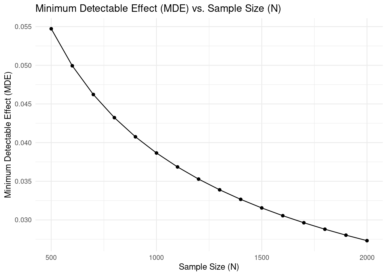
For instance, let's consider a point on the plot. If with a sample size of 1000,
the MDE is approximately
`r round(calculateMdes(N = 1000, sig_lvl = 0.05, power = 0.80, p = 0.5, outcome = "binary", mean_y = 0.05)[[2]], 2)`.
This means that with a total sample size of 1000 (500 in the treatment group
and 500 in the control group), we would be able to detect a reduction in the
churn rate of
`r round(calculateMdes(N = 1000, sig_lvl = 0.05, power = 0.80, p = 0.5, outcome = "binary", mean_y = 0.05)[[2]], 2)*100`
percentage points. If the true reduction in churn rate due to our intervention
is smaller, our experiment might not be powerful enough to detect it as
statistically significant, and we might fail to reject the null hypothesis of no
effect (even if a real, albeit smaller, effect exists).
::: callout-note
## Interpreting MDEs
The MDE curve helps you determine the tradeoff between sample size and
detectable effect size. Larger sample sizes allow you to detect smaller effects,
but at diminishing returns. When planning your study, consider both the smallest
effect size that would be practically meaningful for your business decision and
the resources required for different sample sizes.
:::
### Simulations for Type S and M Errors
To illustrate Type S (Sign) and M (Magnitude) errors in a practical context,
let's consider a simulation based on a common A/B testing scenario. Imagine a
company has a baseline customer churn rate of 5% and aims to detect an impact
of 2 percentage points through some intervention.
The simulation below assesses how frequently a study with a moderate sample size
(n=500 per group) might incorrectly estimate the direction or exaggerate the
magnitude of the observed effect:
Now lets run some simulations to estimate type S and M errors. The code below
runs 10,000 simulations with 500 observations in the treatment and 500 in the
control group, 5% probability of churn for the control group, and and impact
of 2 percentage points for treated units.
```{r}
#| warning: false
#| message: false
library(tidyverse)
library(broom)

estimateTypeSM <- function(p_true_control, lift, n_per_group, alpha, n_sim) {
  p_true_variant <- p_true_control + lift

  simulations <- tibble(
    control_successes = rbinom(n_sim, n_per_group, p_true_control),
    variant_successes = rbinom(n_sim, n_per_group, p_true_variant)
  )

  prop_tests <- map2_df(simulations$control_successes, simulations$variant_successes,
                        ~ tidy(prop.test(c(.x, .y),
                                         n = c(n_per_group, n_per_group),
                                         correct = FALSE))) %>%
    mutate(diff = estimate2 - estimate1)

  significant_results <- prop_tests %>%
    filter(p.value < alpha)

  significant_count <- nrow(significant_results)

  if(significant_count > 0) {
    type_s_rate <- mean(significant_results$diff * lift < 0) * 100
    exaggeration <- mean(abs(significant_results$diff) / abs(lift))
  } else {
    type_s_rate <- 0
    exaggeration <- NA
  }

  list(
    significant_count = significant_count,
    type_s_rate = type_s_rate,
    exaggeration = exaggeration
  )
}

results <- estimateTypeSM(p_true_control = 0.05, lift = 0.02, n_per_group = 500, alpha = 0.05, n_sim = 10000)
```
Out of the 10,000 simulations, only `r results$significant_count` yielded a
statistically significant result. Among these statistically significant results,
`r round(results$type_s_rate, 2)`% incorrectly estimated the direction of the
effect (Type S error). The average exaggeration of the effect size (Type M
error) among the significant results was `r round(results$exaggeration, 2)`x.
## Profit-Maximizing A/B Testing: A Test & Roll Approach
Traditional power calculations in A/B testing focus on managing statistical
significance by controlling Type I and Type II errors. However, in practical
business experiments, the primary goal isn't merely to "reject the null
hypothesis" but to maximize overall profit. The test & roll framework,
introduced by @mcdonnell2018test, re-frames sample size determination as a
strategic decision balancing the cost of learning against the opportunity cost
of deploying a suboptimal treatment.
### Balancing Learning and Opportunity Cost
In conventional A/B tests, achieving high statistical power often requires large
test groups, inadvertently exposing more customers to potentially inferior
treatments. The test & roll framework explicitly addresses two crucial
considerations:
- **The cost of testing:** Every unit allocated to the test phase may
experience a less-than-optimal treatment.
- **The benefit of deployment:** Once the better treatment is identified, it
can be applied to the remainder of the population to maximize profit.
By quantifying these trade-offs explicitly, the optimal (profit-maximizing) test
size is typically smaller than traditional hypothesis testing methods recommend,
particularly when data responses are noisy or population size is limited.
### A Closed-Form Insight
@mcdonnell2018test derived a closed-form formula for determining optimal test
sizes under symmetric Normal priors (assuming no initial preference between
treatments). Formally, the optimal sample size grows as follows:
$$ n^* \propto \sqrt{N} \quad \text{and} \quad n^* \sim \mathcal{O}\left(\frac{s}{\sigma}\right) $$
This implies:
- Optimal test size ($n^*$) scales with the square root of the total available
population ($N$).
- The optimal test size is sensitive to the response noise ($s$) and the
uncertainty in treatment effects ($\sigma$).
More specifically, proposition A.2 in their paper derives:
$$
n^{*}=n_{1}^{*}=n_{2}^{*}=\sqrt{\frac{N}{4}\left(\frac{s}{\sigma}\right)^{2}+\left(\frac{3}{4}\left(\frac{s}{\sigma}\right)^{2}\right)^{2}}-\frac{3}{4}\left(\frac{s}{\sigma}\right)^{2}
$$
This contrasts with traditional power calculations, which typically recommend
sample sizes scaling linearly or super-linearly with variance, often resulting
in overly large tests.
### Extensions to Asymmetric and Complex Settings
The basic test & roll framework can also be extended to account for situations
where prior beliefs about the treatments differ. For instance:
- **Incumbent/Challenger Tests:** If one treatment is well understood (the
incumbent) and the other is more uncertain (the challenger), asymmetric
priors can be used to justify allocating a larger sample to the less-known
treatment.
- **Pricing Experiments:** When treatments involve different price points, the
trade-offs include not only response variability but also differences in
profit per sale. The framework naturally extends to these settings by
adjusting priors to reflect both the likelihood of purchase and the profit
margin.
### Operational Advantages
In practice, the test & roll design helps managers make timely decisions:
- **Smaller, Agile Tests:** By running smaller tests, firms expose fewer
customers to a potentially inferior treatment.
- **Transparency:** The decision rule is based on explicit profit
calculations, making it easier to justify the chosen test size and strategy.
- **Comparable Performance:** Despite its simplicity, the test & roll approach
has been shown to achieve regret—and thus overall performance—that is
comparable to more complex, continuously adaptive methods like Thompson
sampling.
### Summary
By centering experimentation on maximizing business impact rather than solely
achieving statistical significance, the test & roll framework presents a robust,
economically efficient alternative to traditional power-based approaches. It
optimally manages the trade-offs between learning and earning, particularly
advantageous for noisy data or limited customer populations.
## Pilot Strength: A Decision-Centric Approach
Instead of focusing solely on traditional power calculations, let's explore a
slightly different concept: pilot strength. Pilot strength represents the
probability of making the correct decision based on a pilot study with specific
characteristics and assumptions. For instance, we can examine how sample size
influences the strength of a pilot. This decision-centric approach proves
particularly valuable when the traditional frequentist framework might fail to
reject the null hypothesis, yet a decision must still be made with the available
data. To calculate pilot strength, we'll employ simulations.
### Generating Synthetic Data
Let's start by generating synthetic data. Similar to the previous example, we'll
consider a binary outcome like customer churn and an intervention that could
potentially impact it. In our synthetic data, we'll assume the new feature
increases churn by 2 percentage points. Our goal is to decide whether to roll
out this new feature, with the understanding that we should avoid the rollout if
the impact on churn exceeds 1 percentage point.
We'll generate data based on the following assumptions:
1. **Equal Treatment Allocation:** A 50% probability of assignment to the
treatment group.
2. **Churn Probabilities:** A churn probability of 5% for the control group
and 7% for the treatment group.
3. **Time Periods:** Data collection across three time periods, with 20% of
observations in period 1, 50% in period 2, and 30% in period 3.
```{r}
#| warning: false
#| message: false
library(dplyr)
library(rstan)
library(ggpubr)
library(scales)
library(furrr)

# Create a function to generate synthetic data
generate_synthetic_data <-
    function(seed,
             num_observations,
             treatment_proportion,
             control_churn_prob,
             treatment_churn_prob,
             period1_proportion,
             period2_proportion) {
        set.seed(seed)

        # Calculate number of observations in each group and period directly
        num_treatment <- round(num_observations * treatment_proportion)
        num_control <- num_observations - num_treatment
        num_period1 <- round(num_observations * period1_proportion)
        num_period2 <- round(num_observations * period2_proportion)
        num_period3 <- num_observations - num_period1 - num_period2

        # Create data frame using explicit group and period assignments
        synthetic_data <- tibble(
            id = 1:num_observations,
            treat = c(rep(1, num_treatment), rep(0, num_control)),
            period = c(rep(1, num_period1), rep(2, num_period2), rep(3, num_period3))
        ) %>%
            group_by(treat) %>%
            mutate(# Generate binary outcome based on group-specific probabilities
                y = case_when(
                    treat == 0 ~ rbinom(n(), 1, control_churn_prob),
                    TRUE ~ rbinom(n(), 1, treatment_churn_prob)
                )) %>%
            ungroup() # Important: Always ungroup after group_by

        return(synthetic_data)
    }

# Generate synthetic data
synthetic_data <- generate_synthetic_data(
    seed = 123,
    num_observations = 2000,
    treatment_proportion = 0.5,
    control_churn_prob = 0.05,
    treatment_churn_prob = 0.07,
    period1_proportion = 0.2,
    period2_proportion = 0.5
)

glimpse(synthetic_data)
```
The `glimpse()` output provides a summary of the synthetic\_data dataframe. It
confirms that we have 2000 observations with the variables `id`, `treat`
(treatment indicator), `period`, and `y` (binary outcome representing churn).
The true impact of the new feature is a 2 percentage point increase in churn
probability. Our objective is to estimate the probability that this impact
exceeds 1 percentage point, which would lead us to decide against rolling out
the feature.
### A Simple Stan Model to Fit the Data
We'll implement a simple Bayesian logistic regression model to analyze these
synthetic data. This approach allows us to directly estimate the probability
that the treatment effect exceeds our decision threshold.
```{stan output.var = "logit"}
data {
  int N;                          // Number of observations
  array[N] int<lower = 0, upper = 1> y; // Outcome (binary 0 or 1)
  vector[N] treat;      // Treatment indicator
  real mean_alpha;
  real sd_alpha;
  real tau_mean;        // Prior mean for treatment effect
  real<lower=0> tau_sd; // Prior standard deviation for treatment effect
  // Flag for running estimation (0: no, 1: yes)
  int<lower=0, upper=1> run_estimation;
}

parameters {
  real alpha;         // Intercept parameter
  real tau;         // treatment effect parameter
}

model {
  vector[N] theta;        // Linear predictor (stores calculated probabilities)
  // Priors
  alpha ~ normal(mean_alpha, sd_alpha);
  tau ~ normal(tau_mean, tau_sd);
  theta = alpha + tau * treat;     // Calculate linear predictor
  if (run_estimation==1) {
  // Likelihood with logit link function:
      y ~ bernoulli_logit(theta);
  }
}

generated quantities {
  vector[N] y_sim;
  vector[N] y0;
  vector[N] y1;
  real eta;
  real mean_y_sim;
  for (i in 1:N) {
    y_sim[i] = bernoulli_logit_rng(alpha + tau * treat[i]);
    y0[i] = bernoulli_logit_rng(alpha);
    y1[i] = bernoulli_logit_rng(alpha + tau);
    }
  eta = mean(y1) - mean(y0);
  mean_y_sim = mean(y_sim);
}
```
This model allows us to calculate the probability that the intervention elevates
the likelihood of churn by more than our minimum threshold. Let's create a
function to analyze our synthetic data:
```{r}
analyze_synthetic_data <-
  function(data,
           mean_alpha,
           sd_alpha,
           tau_mean,
           tau_sd,
           run_estimation,
           periods,
           threshold) {
    # Filter data
    if (!is.null(periods)) {
      data <- data %>% filter(period %in% periods)
    }

    # Prepare data for Stan
    stan_data <- list(
      N = nrow(data),
      y = data$y,
      treat = data$treat,
      mean_alpha = mean_alpha,
      sd_alpha = sd_alpha,
      tau_mean = tau_mean,
      tau_sd = tau_sd,
      run_estimation = run_estimation
    )

    # Fit Stan model
    posterior <- sampling(logit, # Use the loaded stan model
                          data = stan_data,
                          refresh = 0)

    if (run_estimation == 0) {
      # Prior predictive check
      prior_draws <- posterior::as_draws_df(posterior)
      prior_eta <- prior_draws$eta
      prior_tau <- prior_draws$tau
      prior_mean_y <- prior_draws$mean_y_sim

      # --- Create plots (using your provided structure) ---
      mean_y_plot <- ggplot2::ggplot(
        data = tibble::tibble(draws = prior_mean_y),
        ggplot2::aes(x = draws)
      ) +
        ggplot2::geom_histogram(bins = 30) +
        ggplot2::scale_x_continuous(labels = scales::percent) +
        ggplot2::annotate("text",
                          x = quantile(prior_mean_y, prob = 0.9),
                          y = 200, label = paste0(
                            "mean: ",
                            round(mean(prior_mean_y) * 100, 1)
                          ),
                          hjust = 0
        ) +
        ggplot2::xlab(expression(bar(y))) +  # Using expression for y bar
        ggplot2::ylab("N draws") +
        ggplot2::theme_minimal()

      tau_plot <- ggplot2::ggplot(
        data = tibble::tibble(draws = prior_tau),
        ggplot2::aes(x = draws)
      ) +
        ggplot2::geom_histogram(bins = 30) +
        ggplot2::xlab(expression(tau)) + # Using expression for tau
        ggplot2::ylab("N draws") +
        ggplot2::theme_minimal()

      eta_plot <- ggplot2::ggplot(
        data = tibble::tibble(draws = prior_eta * 100),
        ggplot2::aes(x = draws)
      ) +
        ggplot2::geom_histogram(bins = 30) +
        ggplot2::annotate("text",
                          x = quantile(prior_eta * 100, prob = 0.9),
                          y = 200, label = paste0(
                            "mean: ",
                            round(mean(prior_eta) * 100, 1)
                          ),
                          hjust = 0
        ) +
        ggplot2::geom_vline(xintercept = 2,
                            color = "red",
                            linetype = "dashed") +
        ggplot2::annotate(
          "text",
          x = 2.5,
          y = 250,
          label = "True Effect",
          color = "red",
          hjust = 0
        ) +
        ggplot2::xlab("Impact in percentage points") +
        ggplot2::ylab("N draws") +
        ggplot2::theme_minimal()


      # --- Combine plots with ggarrange ---
      plots <- ggpubr::ggarrange(eta_plot,
                                 ggpubr::ggarrange(tau_plot, mean_y_plot,
                                                   labels = c("tau", "Outcome"),
                                                   ncol = 2),
                                 labels = "Impact", nrow = 2
      )
       plots <- annotate_figure(plots,
                                top = text_grob(
                                 "Draws from prior distributions",
                                 face = "bold",
                                 size = 14
                               ))

      # Calculate probability above threshold
      prob_above_threshold <- mean(prior_eta > threshold)

      # Return the combined plot and probability
      return(list(plot = plots, prob_above_threshold = prob_above_threshold))

    } else {
      # --- Posterior analysis (remains the same) ---
      posterior_draws <- posterior::as_draws_df(posterior)
      posterior_eta <- posterior_draws$eta

      eta_plot <-
        ggplot(data = tibble(draws = posterior_eta * 100), aes(x = draws)) +
        geom_histogram(bins = 30) +
        annotate(
          "text",
          x = quantile(posterior_eta * 100, prob = 0.9),
          y = 200,
          label = paste0("mean: ", round(mean(posterior_eta) * 100, 1)),
          hjust = 0
        ) +
        geom_vline(xintercept = 2,
                   color = "red",
                   linetype = "dashed") +
        annotate(
          "text",
          x = 2.5,
          y = 250,
          label = "True Effect",
          color = "red",
          hjust = 0
        ) +
        labs(x = "Impact (percentage points)", y = "N draws") +
        theme_minimal()

      prob_above_threshold <- mean(posterior_eta > threshold)

      return(list(plot = eta_plot, prob_above_threshold = prob_above_threshold))
    }
  }
```
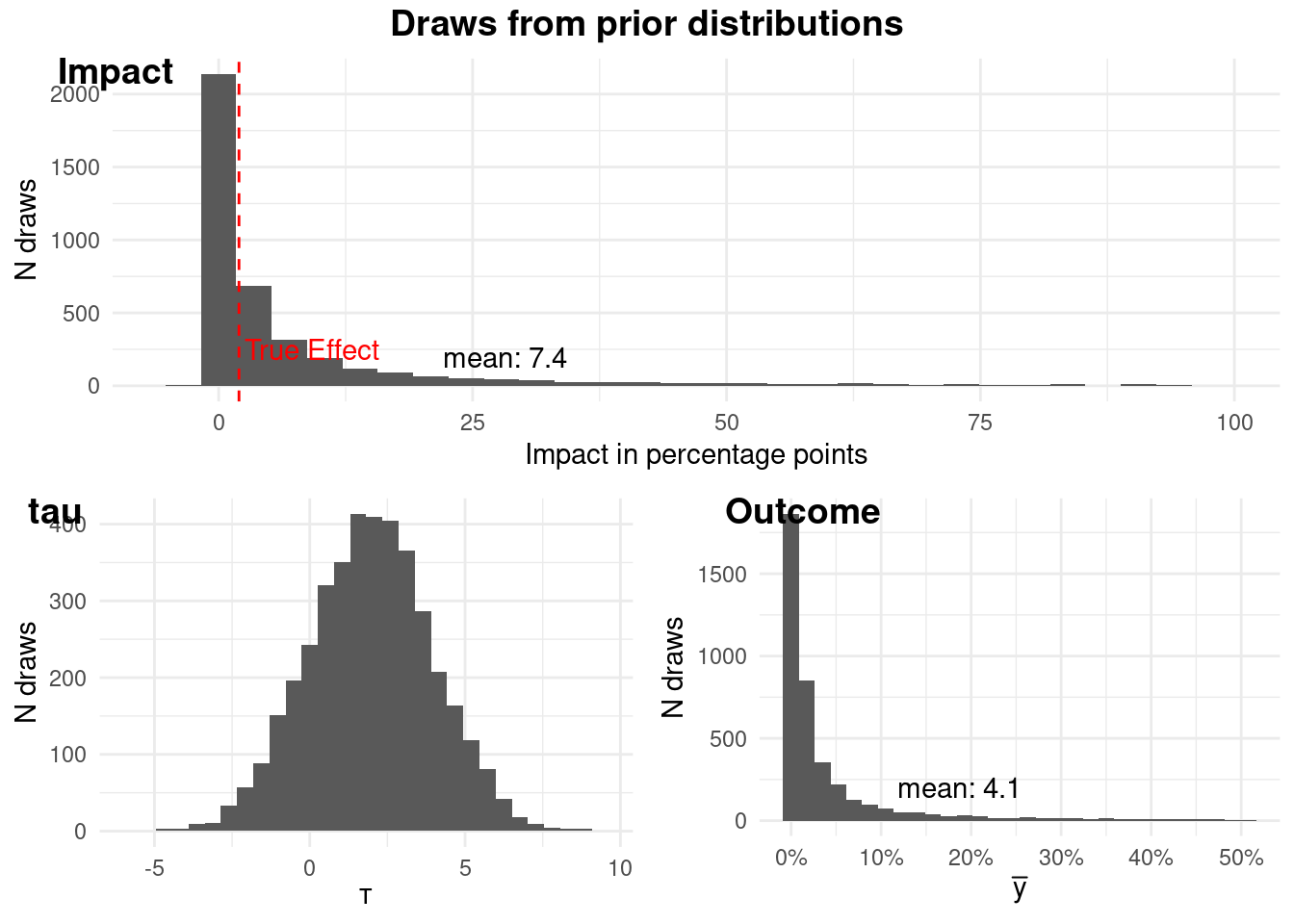
### Prior Predictive Checks
In Bayesian modeling, it's crucial to check if our prior distributions are
reasonable. We use prior predictive checks to simulate data from our prior
distributions and visually assess if these simulated datasets are plausible in
the context of our problem. If the prior predictive distributions generate
implausible data, it might indicate that our priors are misspecified.
```{r}
#| warning: false
#| message: false
prior <- analyze_synthetic_data(
    data = synthetic_data,
    mean_alpha = -6,
    sd_alpha = 1,
    tau_mean = 2,
    tau_sd = 2,
    run_estimation = 0,
    periods = c(1, 2, 3),
    threshold = 0.01
)

# Print the plot
prior$plot
```
The plots above show that our prior distributions for the outcome (churn) and
the impact of the intervention are reasonable. In particular our prior before
seeing the outcome data is that the probability that the intervention has a
meaningful impact is `r scales::percent(prior$prob_above_threshold)`.
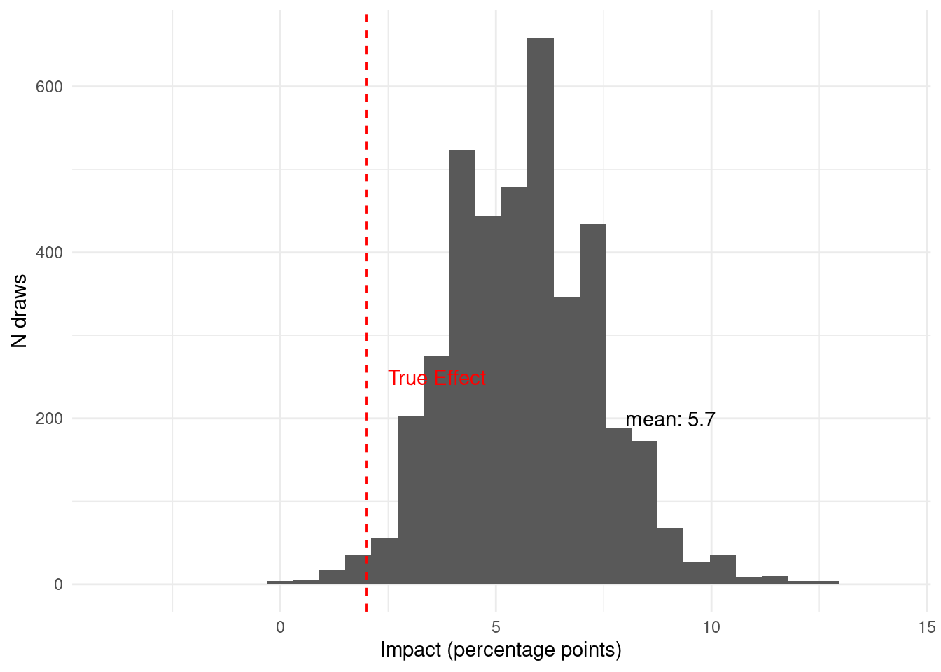
### Sequential Bayesian Updating with Incoming Data
Let's see how our model updates its beliefs as new data becomes available across
different time periods.
```{r}
#| warning: false
#| message: false
period_1 <- analyze_synthetic_data(
    data = synthetic_data,
    mean_alpha = -6,
    sd_alpha = 1,
    tau_mean = 2,
    tau_sd = 2,
    run_estimation = 1,
    periods = c(1),
    threshold = 0.01
)

# Print the plot
period_1$plot
```
Given the data available in period 1, we believe that the probability that the
intervention has a meaningful impact is
`r scales::percent(period_1$prob_above_threshold, accuracy = 0.1)`. This is with
just `r synthetic_data %>% filter(period == 1) %>% nrow()` observations. Now we
can see what happens as we see more data in period 2.
```{r}
#| echo: false
#| warning: false
#| message: false
period_1_2 <- analyze_synthetic_data(
data = synthetic_data,
mean_alpha = -6,
sd_alpha = 1,
tau_mean = 2,
tau_sd = 2,
run_estimation = 1,
periods = c(1,2),
threshold = 0.01
)
# Print the plot
period_1_2$plot
```
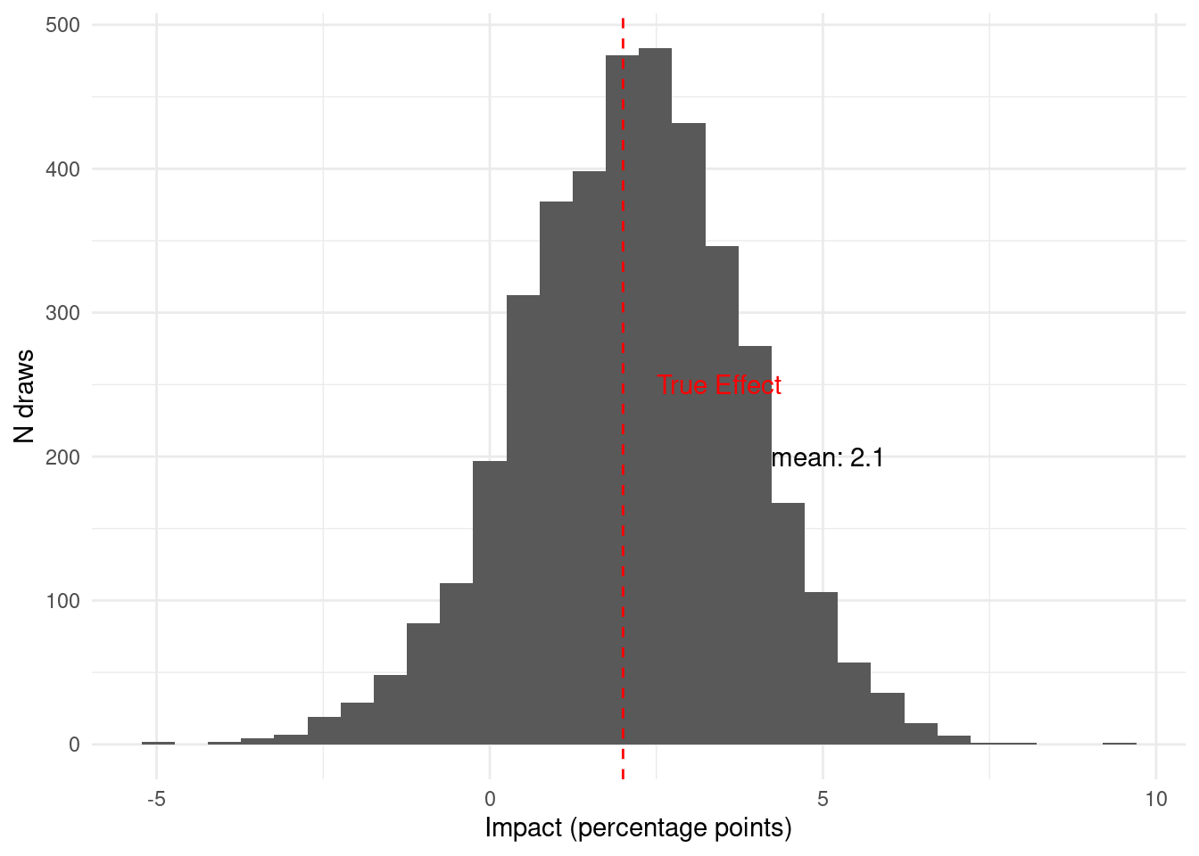
Now, given the data available in period 2, we believe that the probability that
the intervention has a meaningful impact is
`r scales::percent(period_1_2$prob_above_threshold, accuracy = 0.1)`. Notice
that new `r synthetic_data %>% filter(period == 2) %>% nrow()` observations from
period 2 move the posterior quite a bit. Finally, let's see how the data from
period 3 updates the posterior.
```{r}
#| echo: false
#| warning: false
#| message: false
period_1_2_3 <- analyze_synthetic_data(
data = synthetic_data,
mean_alpha = -6,
sd_alpha = 1,
tau_mean = 2,
tau_sd = 2,
run_estimation = 1,
periods = c(1,2,3),
threshold = 0.01
)
# Print the plot
period_1_2_3$plot
```
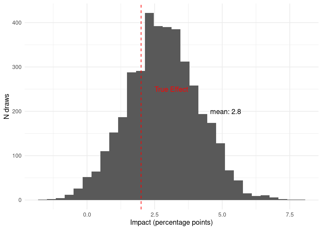
Once we have collected all the data from this pilot, Given the data available in
period 3, we believe that the probability that the intervention has a meaningful
impact is
`r scales::percent(period_1_2_3$prob_above_threshold, accuracy = 0.1)`.
One important thing to notice is that at any moment, including before collecting
any data, we could have made a decision. Then, as we collected more data our
belief changed.
### Calculating the Strength of a Pilot
To calculate the strength of a pilot, we can run a simulation like the one above
many times and see how often we would make the right decision. Moreover, we can
do this under different assumptions.
For all our simulations, we will use the following decision rule: if the
posterior probability that the impact exceeds 1 percentage point is greater
than 75%, we kill the new feature; otherwise, we launch it. For the first set of
simulations, we will assume that the true impact is an increase in churn of 2
percentage points; therefore, killing the new feature is the right choice. We
will also run these simulations assuming our pilot will have 2000 observations,
half in treatment and half in control.
```{r}
run_simulations <-
  function(N,
           num_observations,
           treatment_proportion,
           control_churn_prob,
           treatment_churn_prob,
           period1_proportion,
           period2_proportion,
           mean_alpha,
           sd_alpha,
           tau_mean,
           tau_sd,
           periods,
           threshold,
           num_cores = max(1, parallel::detectCores() - 1)) {
    # Function to run a single simulation
    run_single_sim <- function(i) {
      # Generate synthetic data with a unique seed
      synthetic_data <- generate_synthetic_data(
        seed = i,
        # Use simulation number as seed
        num_observations = num_observations,
        treatment_proportion = treatment_proportion,
        control_churn_prob = control_churn_prob,
        treatment_churn_prob = treatment_churn_prob,
        period1_proportion = period1_proportion,
        period2_proportion = period2_proportion
      )

      # Analyze the synthetic data
      analysis_result <- analyze_synthetic_data(
        data = synthetic_data,
        mean_alpha = mean_alpha,
        sd_alpha = sd_alpha,
        tau_mean = tau_mean,
        tau_sd = tau_sd,
        run_estimation = 1,
        # Run estimation
        periods = periods,
        threshold = threshold
      )

      return(analysis_result$prob_above_threshold)
    }

    # Run simulations using purrr (parallel or sequential)
    probabilities <- 1:N %>%
      {
        if (num_cores > 1) {
          # Use future_map_dbl for parallel execution
          future::plan(future::multisession, workers = num_cores) # Setup parallel processing
          furrr::future_map_dbl(., run_single_sim, .options = furrr::furrr_options(seed = TRUE, packages = "rstan"))
        } else {
          # Use map_dbl for sequential execution
          purrr::map_dbl(., run_single_sim)
        }
      }

    return(probabilities)
  }
```
Let's run the simulations with 2000 observations:
```{r}
#| warning: false
#| message: false
#| cache: true
simulations <- run_simulations(
  N = 200,
  num_observations = 2000,
  treatment_proportion = 0.5,
  control_churn_prob = 0.05,
  treatment_churn_prob = 0.07,
  period1_proportion = 0.2,
  period2_proportion = 0.5,
  mean_alpha = -6,
  sd_alpha = 1,
  tau_mean = 2,
  tau_sd = 2,
  periods = c(1, 2, 3),
  threshold = 0.01,
  num_cores = max(1, parallel::detectCores() - 1)
)
```
The simulation results tell us that, with our chosen priors, model, pilot size,
and decision rule, we correctly kill the new feature (when it truly has a
meaningful impact) in approximately
`r scales::percent(mean(simulations > 0.75))` of the simulated pilot studies.
Next we can run this simulation under the assumption that instead of 2000
observations we will only have 1000 observations.
```{r}
#| warning: false
#| message: false
#| cache: true
simulations <- run_simulations(
  N = 200,
  num_observations = 1000,
  treatment_proportion = 0.5,
  control_churn_prob = 0.05,
  treatment_churn_prob = 0.07,
  period1_proportion = 0.2,
  period2_proportion = 0.5,
  mean_alpha = -6,
  sd_alpha = 1,
  tau_mean = 2,
  tau_sd = 2,
  periods = c(1, 2, 3),
  threshold = 0.01,
  num_cores = max(1, parallel::detectCores() - 1)
)
```
Now we can see that if the pilot only has 1000 observations, we would make the
right decision only `r scales::percent(mean(simulations > 0.75))` of the time.
Similarly, we can now change our data generating process so that the true effect
of the intervention is zero. In the right decision would be to roll out the new
feature.
```{r}
#| warning: false
#| message: false
#| cache: true
simulations <- run_simulations(
  N = 200,
  num_observations = 1000,
  treatment_proportion = 0.5,
  control_churn_prob = 0.05,
  treatment_churn_prob = 0.05, # <-same as control_churn_prob
  period1_proportion = 0.2,
  period2_proportion = 0.5,
  mean_alpha = -6,
  sd_alpha = 1,
  tau_mean = 2,
  tau_sd = 2,
  periods = c(1, 2, 3),
  threshold = 0.01,
  num_cores = max(1, parallel::detectCores() - 1)
)
```
In this case, the probability of making the right choice (rolling out the new feature when it has no meaningful impact on churn) is `r scales::percent(mean(simulations < 0.75))`.
::: callout-tip
## Learn more
- @dong2013powerup PowerUp!: A tool for calculating minimum detectable effect sizes and minimum required sample sizes for experimental and quasi-experimental design studies.
- @bloom2008core The core analytics of randomized experiments for social research.
- @gelman2014beyond Beyond power calculations: Assessing type S (sign) and type M (magnitude) errors.
- @mcdonnell2018test Test & Roll: Profit-Maximizing A/B Tests.\
:::