---
title: "Bayesian Structural Time Series"
share:
permalink: "https://book.martinez.fyi/causalimpact.html"
description: "Business Data Science: What Does it Mean to Be Data-Driven?"
linkedin: true
email: true
mastodon: true
author:
- name: Eray Turkel
- name: Ignacio Martinez
---
In the fast-paced digital landscape, businesses continuously seek ways to
measure the impact of their interventions, such as marketing campaigns, pricing
adjustments, or product launches. The difficulty arises in discerning the
intervention's effect from the natural fluctuations of business metrics.
Bayesian structural time series emerges as a tool that, when employed
judiciously, can leverage data to steer your decisions. However, if used without
grasping the underlying assumptions, it can lead to misguided choices while
creating a false sense of data-driven decision-making.
Fundamentally, this method constructs a counterfactual scenario—what would have
transpired if the intervention hadn't taken place. It accomplishes this by
learning patterns from the pre-intervention period and from analogous time
series not subject to the intervention. The divergence between this
counterfactual and the actual outcome is then ascribed to the intervention.
The [{causalImpact}](https://github.com/google/CausalImpact) R package is a
widely used implementation of this methodology. Let's illustrate its application
with a simple example from the package
[vignette](https://google.github.io/CausalImpact/CausalImpact.html):
```{r casualimapct, message=FALSE}
library(CausalImpact)
library(dplyr)
library(ggplot2)
# Generate synthetic data
set.seed(1) # Set the random seed for reproducibility
x1 <- 100 + arima.sim(model = list(ar = 0.999), n = 100) # Simulated covariate
y <- 1.2 * x1 + rnorm(100) # Simulated outcome with a linear relationship to x1
y[71:100] <- y[71:100] + 10 # Introduce an intervention effect in the latter part of the series
data <- cbind(y, x1) # Combine outcome and covariate into a data matrix
# Define pre- and post-intervention periods
pre.period <- c(1, 70)
post.period <- c(71, 100)
# Estimate causal impact
impact <- CausalImpact(data, pre.period, post.period) # Main function to estimate the impact
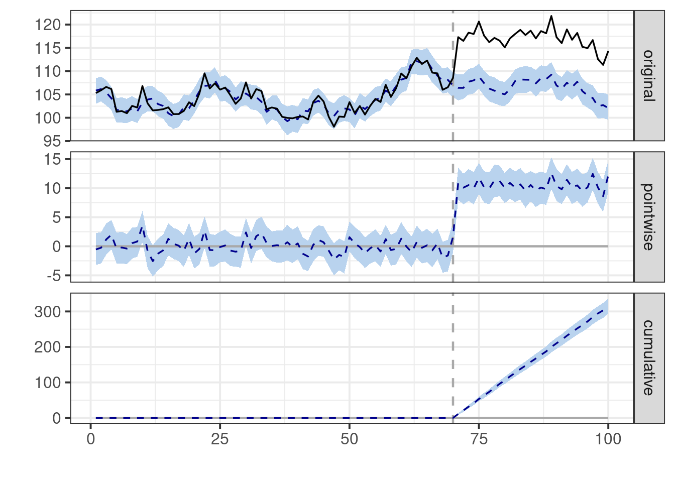
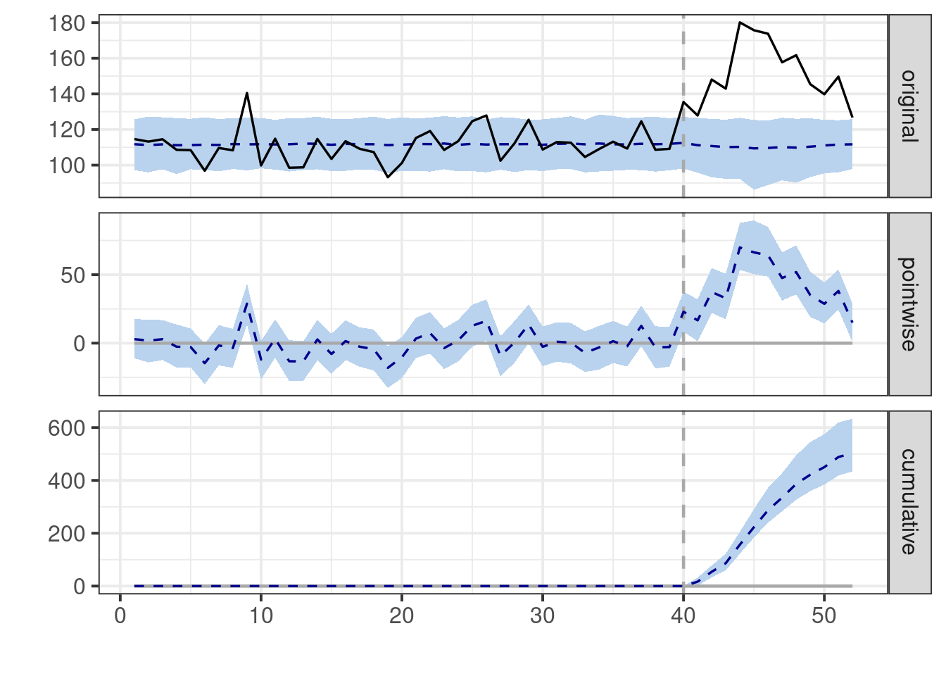
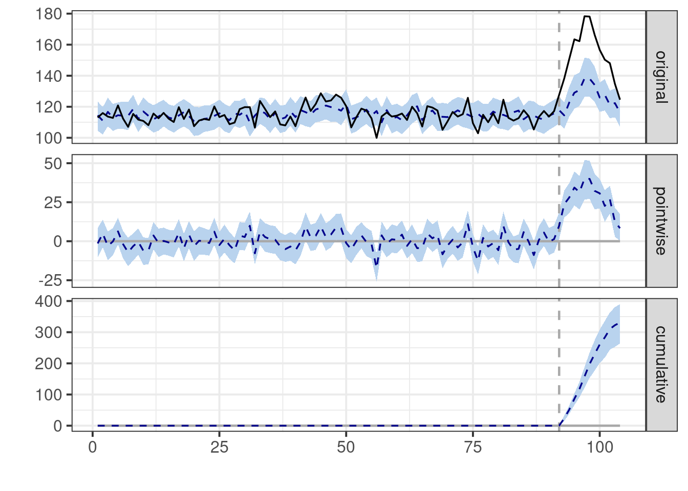
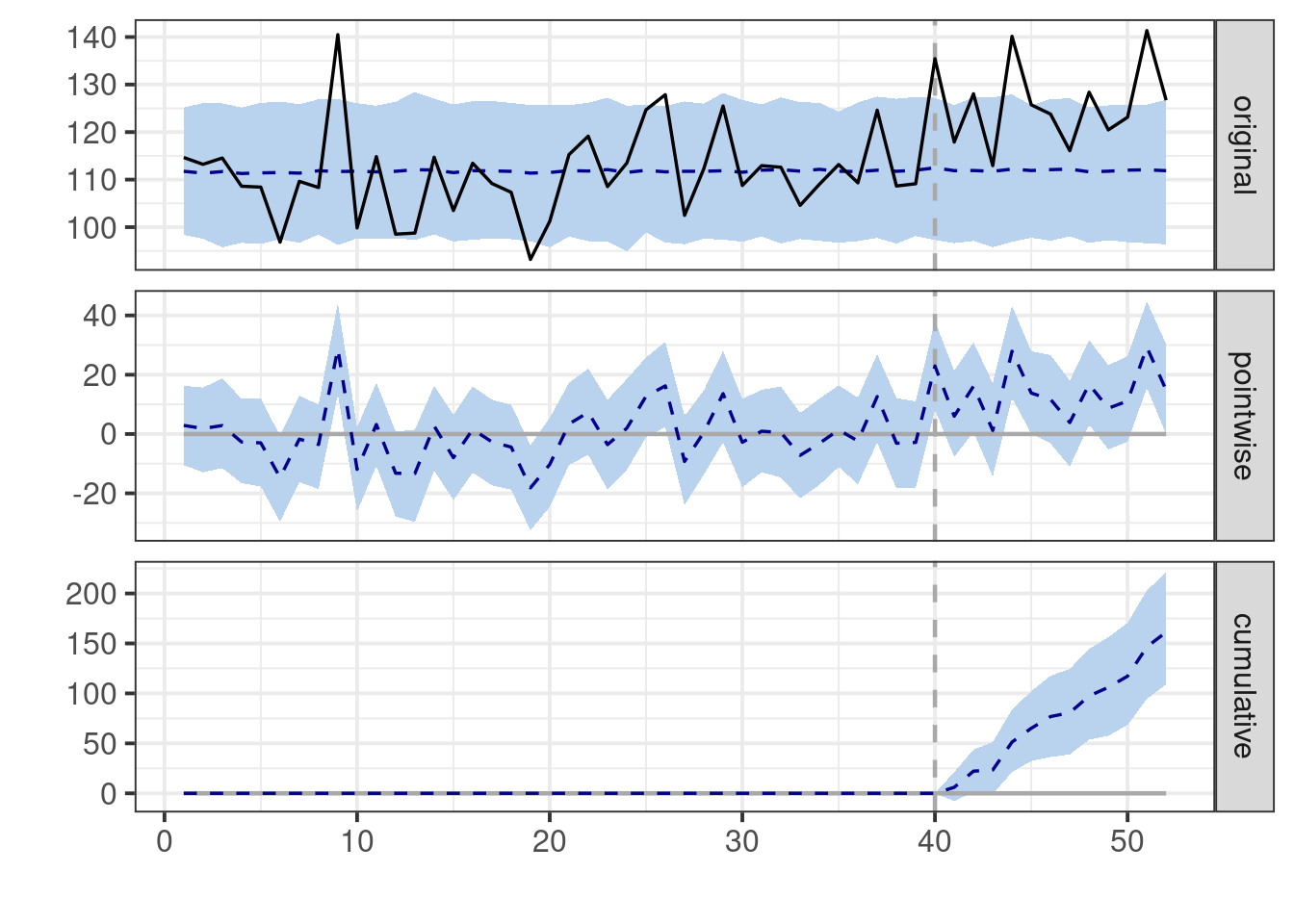
# Visualize results
plot(impact) # Default plot with three panels
```
The default plot produced by this code consists of three panels. The first panel
displays the data alongside a counterfactual prediction for the post-treatment
period. The second panel shows the discrepancy between the observed data and the
counterfactual predictions, representing the estimated pointwise causal effect.
In the third panel, these pointwise contributions are summed, resulting in a
plot of the intervention's cumulative effect.
## Caveats and Assumptions
When using this tool, we must tread carefully. The allure of a method that
promises to quantify causal effects is strong, but like any statistical
technique, it comes with caveats that are crucial to understand.
At the heart of this method lie two critical assumptions:
1. **Stability and Generalizability:** The model assumes that the relationship
between the covariates and the treated time series, which it learns from the
pre-intervention period, remains stable and generalizable to the
post-intervention period. In essence, it's betting that the past is a
reliable guide to the future. This is akin to assuming that if you've
observed how interest rates affect inflation for the past decade, that
relationship will hold true for the next year, regardless of any policy
changes.
2. **Unaffected Covariates:** The model's ability to construct a reliable
counterfactual hinges on the assumption that the intervention does not
affect the covariates used in the analysis. It's like assuming that when the
Federal Reserve changes interest rates, it doesn't influence other economic
indicators we're using to predict inflation.
These assumptions are not mere technicalities - they're the foundation upon
which the entire inferential structure is built. If they crumble, so does our
ability to draw causal conclusions.
::: {.callout-important}
It's paramount to remember that causality is not a property that can be
magically extracted from data through algorithmic means. No matter how
sophisticated the method, whether Bayesian structural time series or any other
causal inference algorithm, it cannot definitively establish causality on its
own. Causality emerges from our understanding of the world, our theories about
how things operate, and the assumptions we are willing to embrace.
:::
## Cautionary Tale: Stability
Misinterpreting the findings of a {causalImpact} study can occur in several
ways.
In practice, it may be relatively straightforward to find exogenous covariates
for predicting the outcome that are not directly affected by the treatment
themselves.
A critical threat, even in this setting, is the assumption of stability and
generalizability of the relationship between covariates and the treated time
series.
How can this assumption lead us astray? Let's consider a few illustrative
scenario
### Simple Setup
Imagine we are conducting an intervention in one geographic region, and we
leverage data from other regions to predict the outcome for the treated region.
```{r baseline}
generate_baseline_data<-function(
    n_cities,n_weeks,
    base_min, base_max,
    noise_sd){

    #City ID's
    cities <- paste("City", 1:n_cities)

    # Base values
    base_values <- runif(
      n_cities,
      min = base_min,
      max = base_max)  # Random base value for each city

    sim_data <- data.frame(
      week = rep(1:n_weeks, times = n_cities)) %>%
      mutate(
        city = rep(cities, each = n_weeks),
        base_value = rep(runif(n_cities, base_min, base_max), each = n_weeks),
        random_noise = rnorm(n(), sd = noise_sd),
        value = base_value + random_noise
      )
    return(sim_data)

    }

# Seed for reproducibility
set.seed(42)

data<-generate_baseline_data(
  n_cities=5,
  n_weeks=52,
  base_min=100,
  base_max=200,
  noise_sd=10)

ggplot(data, aes(x = week, y = value, color = city)) +
  geom_line() +
  labs(x = "Week", y = "Value", title = "Simulated Weekly Time Series") +
  theme_minimal()
```
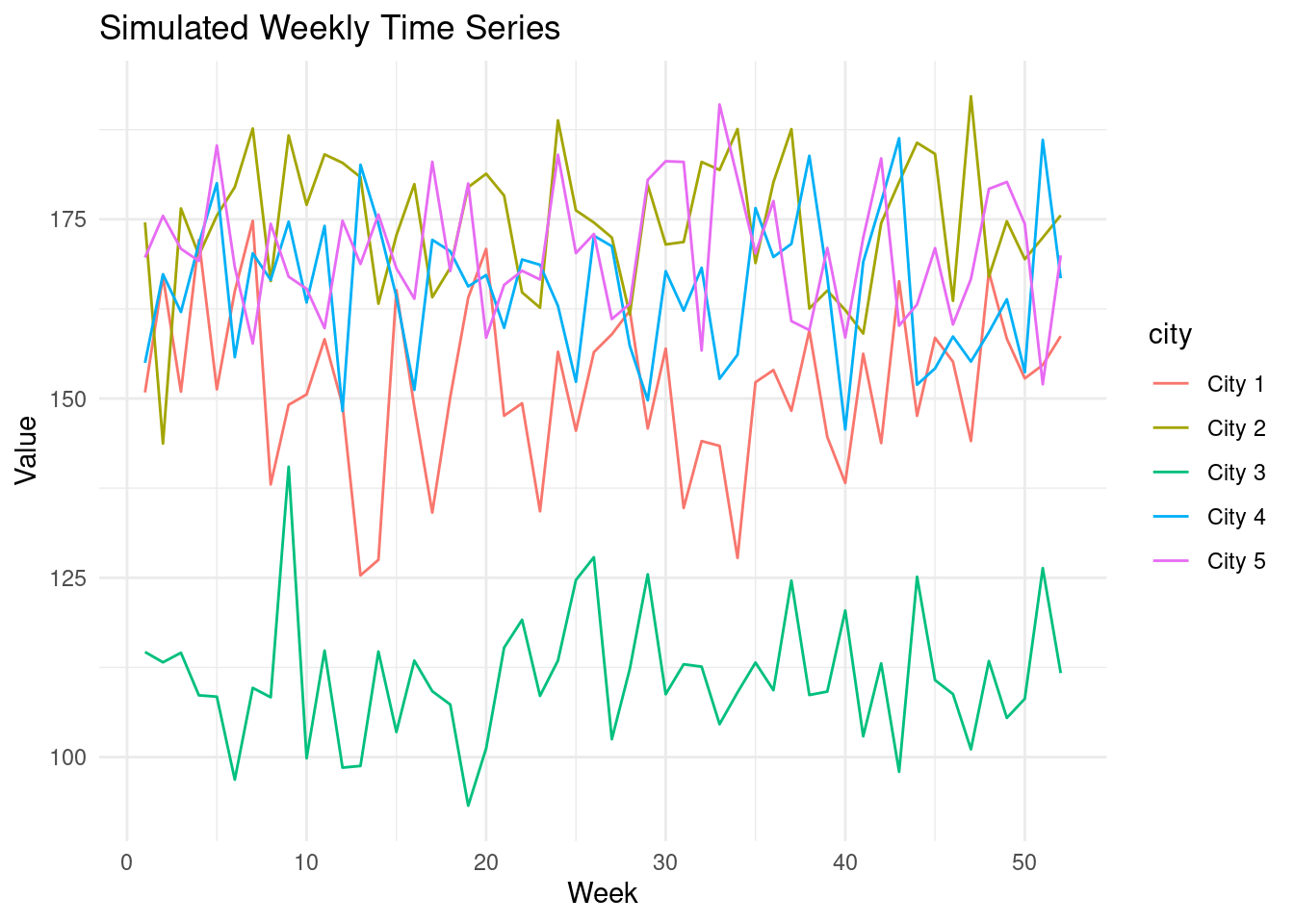
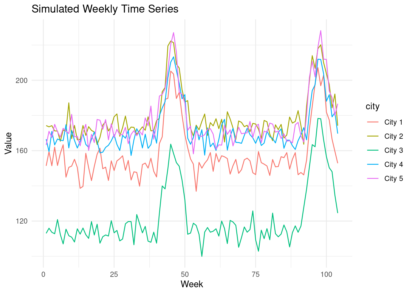
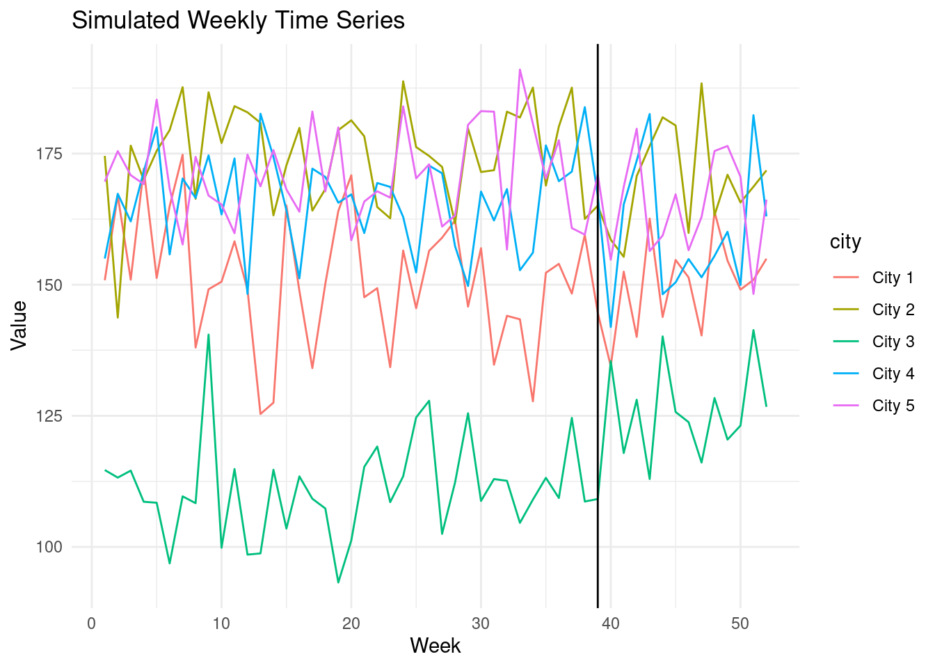
CausalImpact performs reasonably well in a stable environment. In this example,
we have 5 cities with a stable trend.
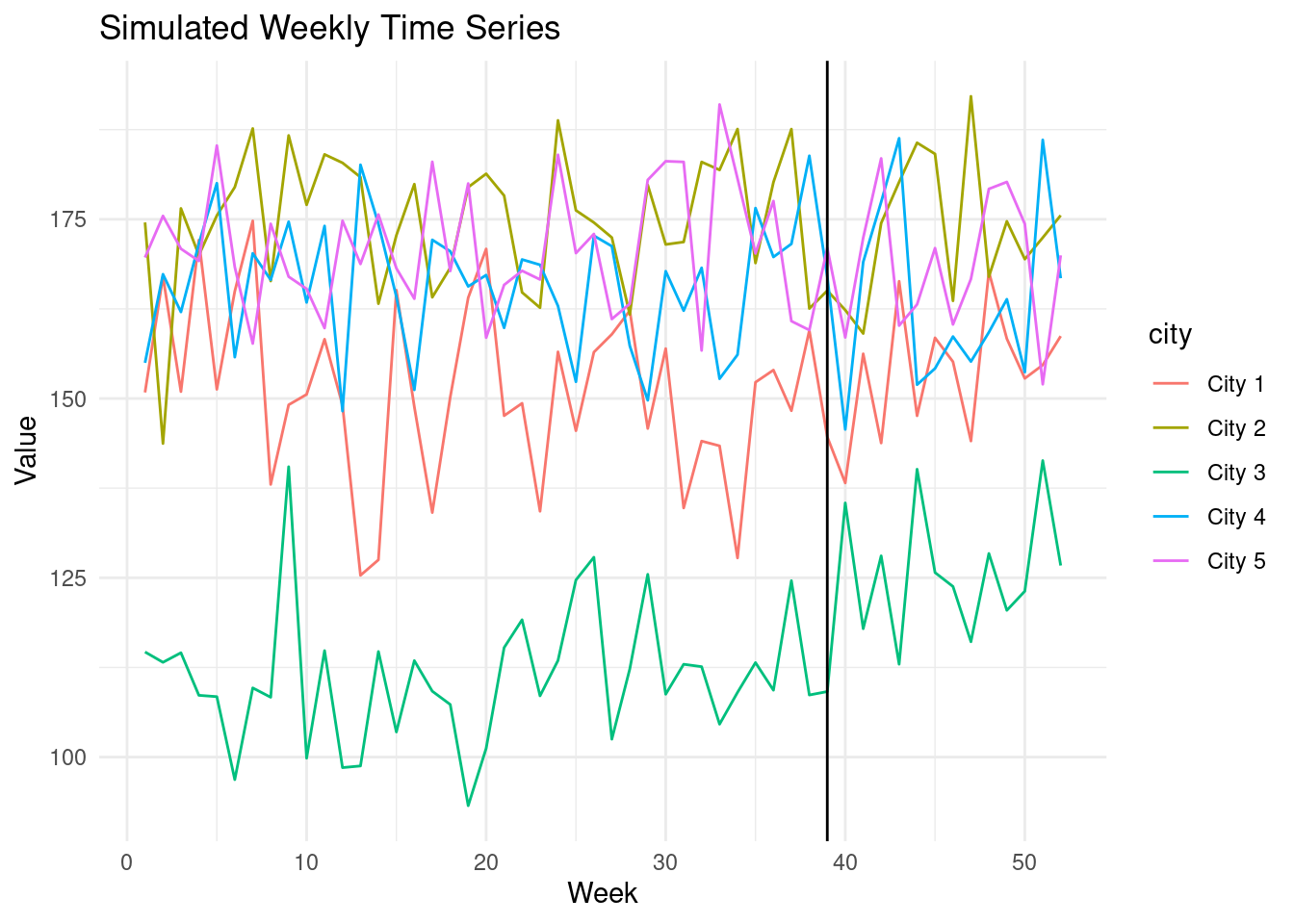
Let's suppose our campaign is run in city 3, starting in October. The campaign
has a small effect.
```{r treated_data}
add_constant_treatment_effect<-function(
data,
target_city_id,
start_week,
end_week,
effect_size
){
data %>%
mutate(
treatment = ifelse( # Treatment indicator
city == target_city_id & week >= start_week & week <= end_week, 1, 0)
) %>%
mutate(
treatment_effect = ifelse(treatment == 1, effect_size, 0), # <1>
value = value + treatment_effect # Add treatment effect to City 3's values
) -> treated_data
return(treated_data)
}
treated_data <- add_constant_treatment_effect(
data,
target_city_id = "City 3",
start_week=40,
end_week=52,
effect_size=15 # <1>
)
ggplot(treated_data, aes(x = week, y = value, color = city)) +
geom_line() +
labs(x = "Week", y = "Value", title = "Simulated Weekly Time Series") +
geom_vline(xintercept = 39, color = "black")+
theme_minimal()
```
1. Note that the true impact is 15 and constant.
Let's see how CausalImpact fares in the face of this uncomplicated intervention.
```{r}
# Data preparation for CausalImpact
CI_data_prep<-function(data){
CI_input <- data %>%
select(week, city, value) %>%
tidyr::pivot_wider(
names_from = city,
values_from = value) %>%select(-week)
# Get the treated city:
data %>%
filter(treatment == 1) %>%
select(city) %>% pull() %>% unique() -> treated_city_id
# Rename columns
colnames(CI_input)[colnames(CI_input) == treated_city_id] <- "Y"
colnames(CI_input)[colnames(CI_input) != "Y"] <- paste0("X", 1:(ncol(CI_input)-1))
# Relocate the treated city to be the first column for CI
CI_input <- relocate(CI_input, Y)
data %>%
filter(treatment == 1) %>%
select(week) %>% pull() %>% min() -> treatment_start
data %>%
filter(treatment == 1) %>%
select(week) %>% pull() %>% max() -> treatment_end
pre_period <- c(1, treatment_start)
post_period <- c(treatment_start+1, treatment_end)
return(list(
CI_input_matrix= as.matrix(CI_input),
pre_period = pre_period,
post_period = post_period
))
}
CI_inputs<-CI_data_prep(treated_data)
impact <- CausalImpact(
CI_inputs$CI_input_matrix,
CI_inputs$pre_period,
CI_inputs$post_period)
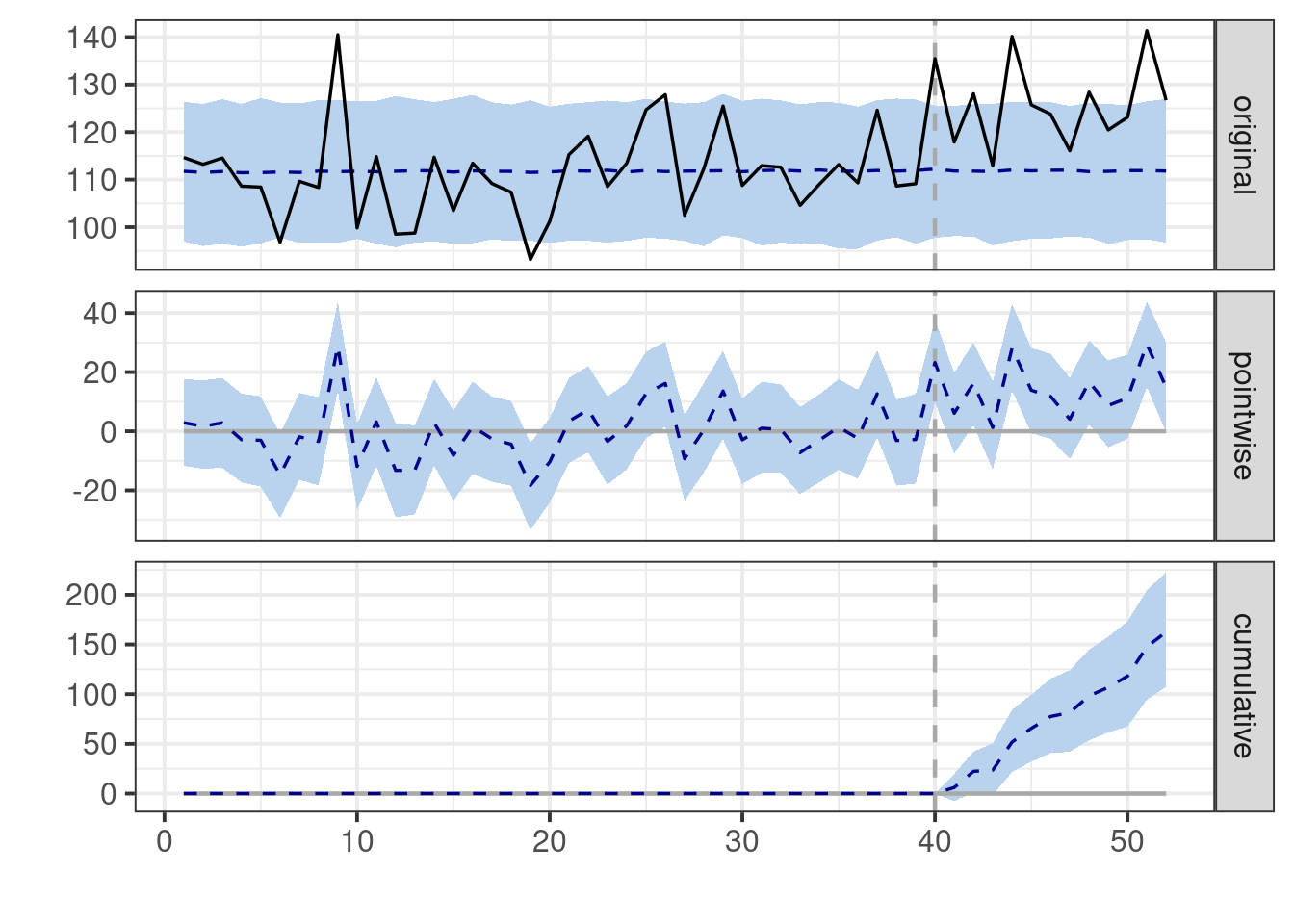
# Summary of results
summary(impact)
# Plot the results
plot(impact)
```
::: {.callout-important}
If we look at the summary table we can get by running `summary(impact)` the
first thing you will probably notice is that the model estimates a point
estimate for the average treatment effect equal to
`r round(impact$summary$AbsEffect[[1]],0)` which is very close to the truth
(15). However, a common misinterpretation arises from the unfortunate line that
reads "Posterior prob. of a causal effect: 99%". **This statement is
unequivocally incorrect!** Neither this package nor any other can estimate the
probability of a causal effect. This number merely represents the posterior
probability that the estimated effect exceeds zero.
:::
With this simple example out of the way, let's introduce some seasonality to see
how the model handles a bit more complexity.
### Example with seasonality
Let's suppose that towards the end of the year, there's a natural seasonal
increase for every city, coinciding with our treatment start. Assume the
seasonality is identical across all cities.
```{r seasonal}
add_seasonal_effect<-function(
    data,
    seasonal_start,
    seasonal_end,
    magnitude
){

  n_seasonal_weeks <- floor((seasonal_end - seasonal_start)/2)

  seasonal_effect <- c(
  seq(0,magnitude,length.out = n_seasonal_weeks), # Seasonality Ramp Up
  seq(magnitude,0,length.out = n_seasonal_weeks+1)) # Seasonality Ramp Down


  seasonal_data <- data %>%
    group_by(city) %>%
    mutate(
    seasonal =  ifelse(
      week >= seasonal_start & week <= seasonal_end,
      seasonal_effect,
      0
      )
    ) %>%
    ungroup() %>%
    mutate(value = seasonal + value)

  return(seasonal_data)

}


# Seasonal effect
seasonal_data<-add_seasonal_effect(
  treated_data,
  seasonal_start=40,
  seasonal_end=52,
  magnitude=50)


ggplot(seasonal_data, aes(x = week, y = value, color = city)) +
  geom_line() +
  labs(x = "Date", y = "Value", title = "Simulated Weekly Time Series") +
  theme_minimal()
```
```{r sesonal_impact}
# Data preparation for CausalImpact
CI_inputs<-CI_data_prep(seasonal_data)

impact <- CausalImpact(
  CI_inputs$CI_input_matrix,
  CI_inputs$pre_period,
  CI_inputs$post_period)

# Summary of results
summary(impact)
# Plot the results
plot(impact)
```
Notice how the estimated effect is now much larger than the true effect of our
intervention.
The plots reveal the underlying issue: Our model presumes a 'stable'
relationship based on what it learned in the pre-period, and extrapolates these
patterns into the post-period. Any deviation from this extrapolated prediction
is incorrectly attributed to our intervention.
Since we lack historical observations with seasonality for the model to learn
from, it conflates the seasonal increases with the effect of our intervention.
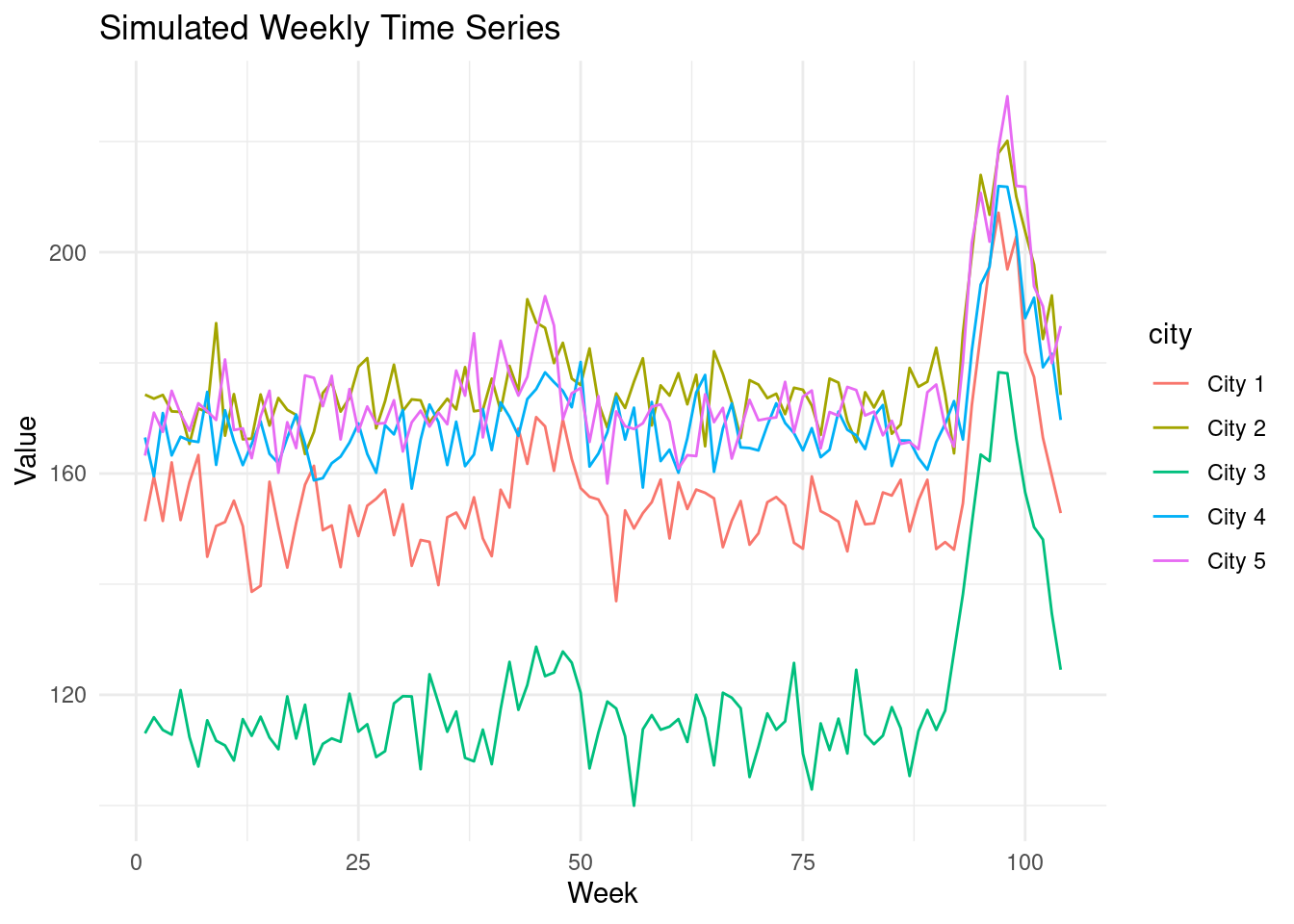
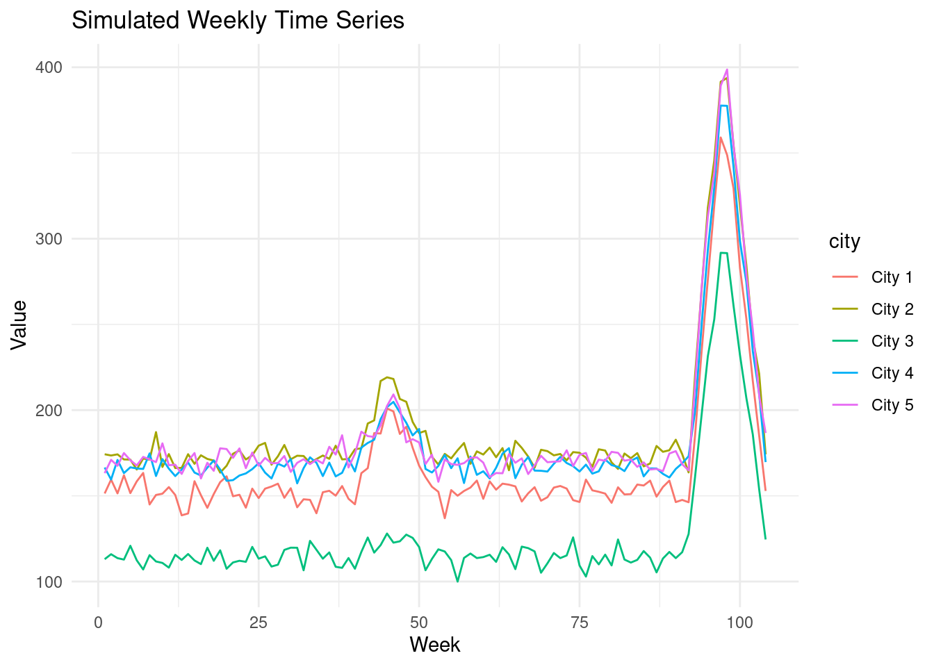
### What if we had more data?
You might suspect that having enough data to learn seasonal patterns from prior
years would help. Let's extend our simulation to two years to test this.
Suppose our intervention again has a modest effect in the second year. We can
utilize the prior year's data to learn the pattern of seasonality.
```{r more_data}
# Two years of baseline data
set.seed(42)
two_year_data<-generate_baseline_data(
  n_cities=5,
  n_weeks=104,
  base_min=100,
  base_max=200,
  noise_sd=5)

# Add simulated treatment effect to the second year
two_year_treated_data <- add_constant_treatment_effect(
  two_year_data,
  target_city_id = "City 3",
  start_week=92,
  end_week=104,
  effect_size=15 # True effect size.
)

# Add first year seasonality
two_year_seasonal_data<-add_seasonal_effect(
  two_year_treated_data,
  seasonal_start=40,
  seasonal_end=52,
  magnitude=50)

# Add second year seasonality
two_year_seasonal_data<-add_seasonal_effect(
  two_year_seasonal_data,
  seasonal_start=92,
  seasonal_end=104,
  magnitude=50)


ggplot(two_year_seasonal_data, aes(x = week, y = value, color = city)) +
  geom_line() +
  labs(x = "Week", y = "Value", title = "Simulated Weekly Time Series") +
  theme_minimal()
```
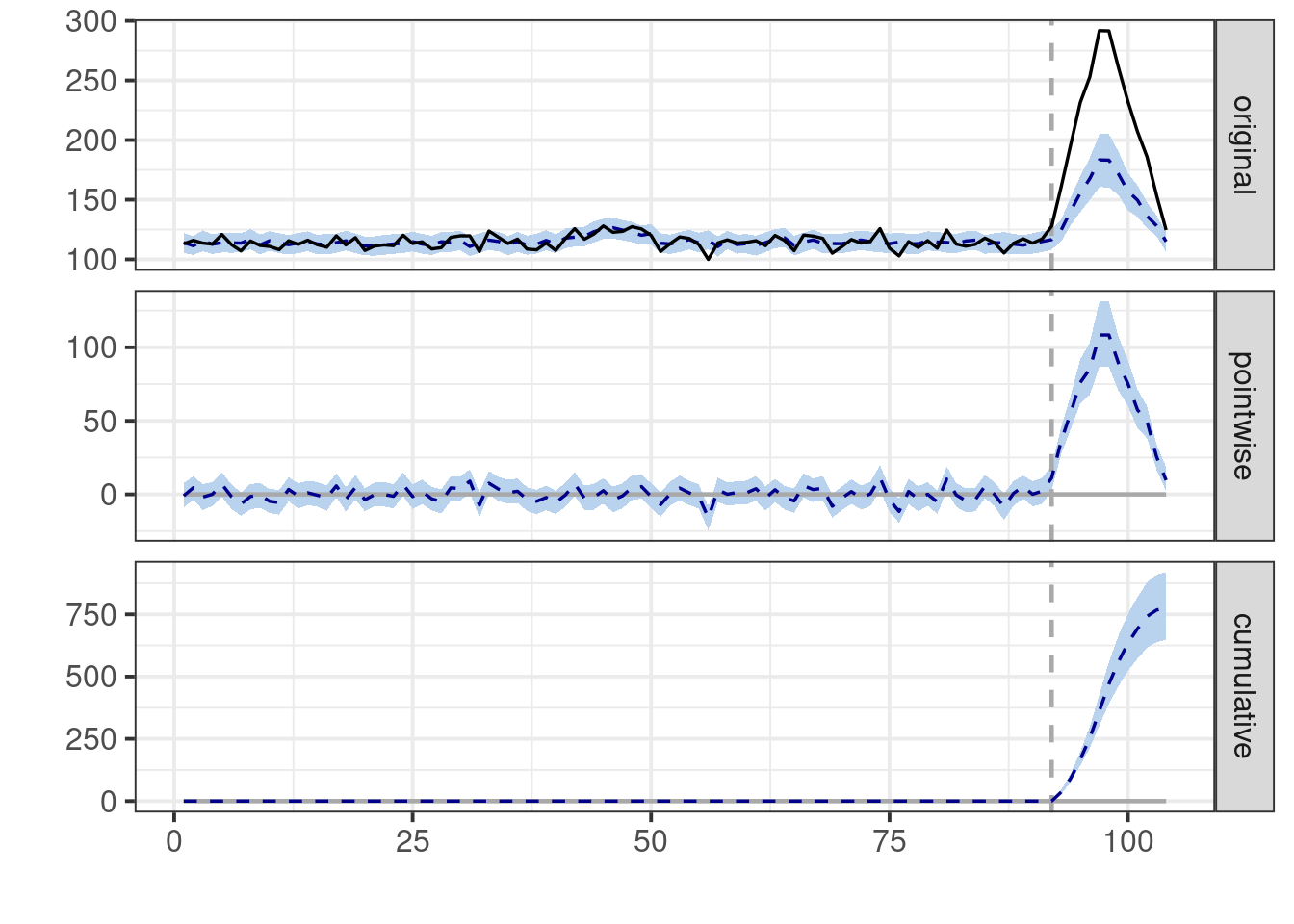
```{r impact_more_data}
# Data preparation for CausalImpact
CI_inputs<-CI_data_prep(two_year_seasonal_data)

impact <- CausalImpact(
  CI_inputs$CI_input_matrix,
  CI_inputs$pre_period,
  CI_inputs$post_period)

# Summary of results
summary(impact)
# Plot the results
plot(impact)
```
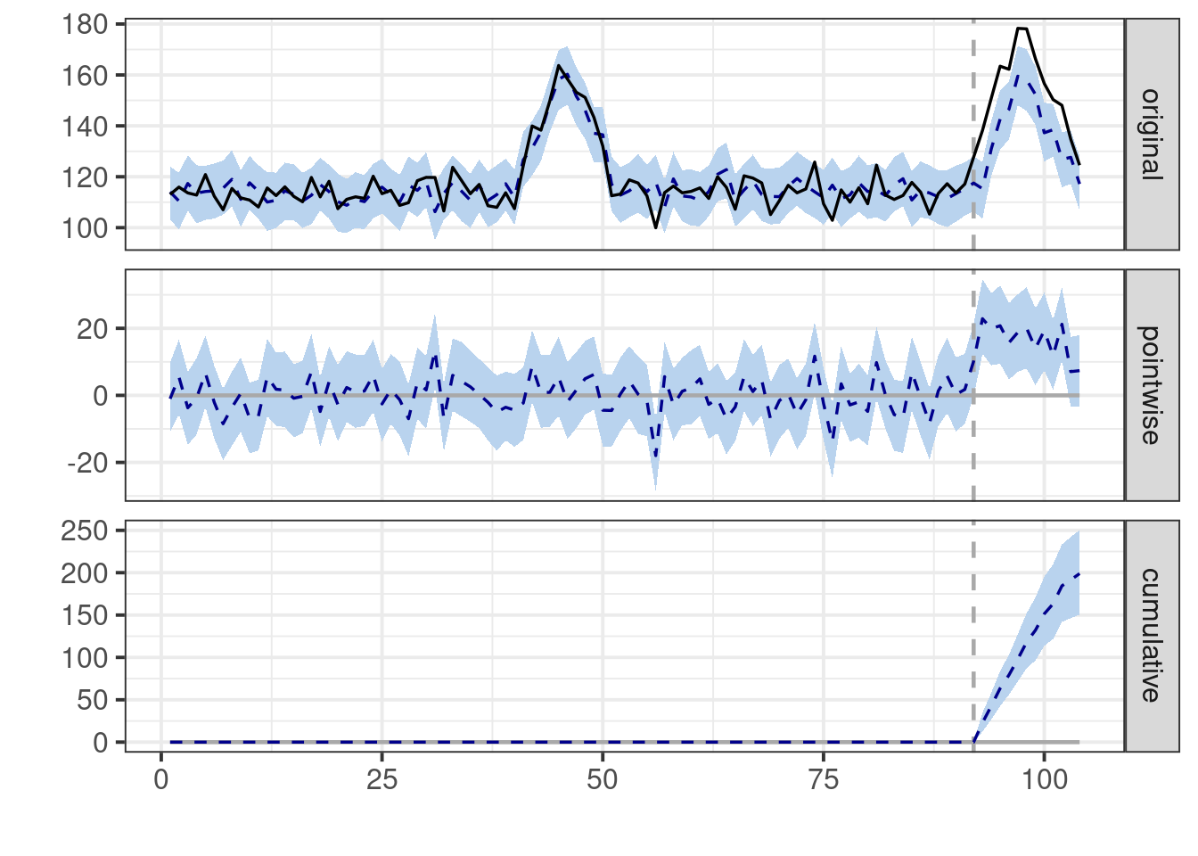
It appears that in this scenario, the model does manage to get closer to the
true effect of our intervention.
However, note that the pattern of seasonality is exactly the same from year 1 to
year 2. This level of stability is rarely encountered in the real world.
### What if Seasonal Patterns Change?
Consider the case where last year's seasonality was much lower than usual due to
a special event.
```{r change}
# Change to smaller first year seasonality
two_year_seasonal_data<-add_seasonal_effect(
  two_year_treated_data,
  seasonal_start=40,
  seasonal_end=52,
  magnitude=15)

# Add larger second year seasonality
two_year_seasonal_data<-add_seasonal_effect(
  two_year_seasonal_data,
  seasonal_start=92,
  seasonal_end=104,
  magnitude=50)


ggplot(two_year_seasonal_data, aes(x = week, y = value, color = city)) +
  geom_line() +
  labs(x = "Week", y = "Value", title = "Simulated Weekly Time Series") +
  theme_minimal()
```
```{r impact_change}
# Data preparation for CausalImpact
CI_inputs<-CI_data_prep(two_year_seasonal_data)

impact <- CausalImpact(
  CI_inputs$CI_input_matrix,
  CI_inputs$pre_period,
  CI_inputs$post_period)

# Summary of results
summary(impact)
# Plot the results
plot(impact)
```
Once again, the model struggles in the presence of changing seasonal patterns
because it assumes stability. If last year's seasonal patterns differ from this
year's, any difference is erroneously attributed to the treatment, leading us to
an incorrect conclusion.
### Heterogeneous Seasonality
So far, we've explored scenarios with uniform seasonality across cities, even if
it varied year over year.
But what if seasonal patterns are heterogeneous between units? Things become
even trickier.
```{r heterogeneous_seasonality}
add_random_seasonal_effect<-function(
    data,
    seasonal_start,
    seasonal_end,
    max_magnitude,
    min_magnitude
){

  n_seasonal_weeks <- floor((seasonal_end - seasonal_start)/2)

  seasonal_data <- data %>%
    group_by(city) %>%
    mutate(
    seasonal_coef = runif(n=1, min=min_magnitude, max= max_magnitude),
    seasonal =  ifelse(
      week >= seasonal_start & week <= seasonal_end,
      c(seq(0,seasonal_coef[1],length.out = n_seasonal_weeks),
      seq(seasonal_coef[1],0,length.out = n_seasonal_weeks+1)),
      0
      )
    ) %>%
    ungroup() %>%
    mutate(value = seasonal + value)

  return(seasonal_data)

}


set.seed(42)

# Smaller random first year seasonality
two_year_seasonal_data<-add_random_seasonal_effect(
  two_year_treated_data,
  seasonal_start=40,
  seasonal_end=52,
  max_magnitude=50,
  min_magnitude=0)

# Larger random second year seasonality
two_year_seasonal_data<-add_random_seasonal_effect(
  two_year_seasonal_data,
  seasonal_start=92,
  seasonal_end=104,
  max_magnitude=250,
  min_magnitude=150)


ggplot(two_year_seasonal_data, aes(x = week, y = value, color = city)) +
  geom_line() +
  labs(x = "Week", y = "Value", title = "Simulated Weekly Time Series") +
  theme_minimal()
```
```{r ht_impact}
# Data preparation for CausalImpact
CI_inputs<-CI_data_prep(two_year_seasonal_data)

impact <- CausalImpact(
  CI_inputs$CI_input_matrix,
  CI_inputs$pre_period,
  CI_inputs$post_period)

# Summary of results
summary(impact)
# Plot the results
plot(impact)
```
As we can see, the model's performance deteriorates further when faced with
heterogeneous seasonal patterns. The estimated effect is now nowhere near the
true effect, underscoring the challenges inherent in causal inference when
seasonality varies across units. In essence, the model is attempting to fit a
single seasonal pattern to all cities, while each city exhibits its own unique
seasonal fluctuations. This mismatch leads to a significant bias in the
estimated treatment effect.
## Cautionary Tale: Spillovers
Another key assumption of the CausalImpact model is that the covariates used to
predict the outcome of interest are not themselves affected by the intervention.
In certain situations, this assumption is reasonable, while in others, it's less
so. For example, we might be testing different interventions on our customers,
who then communicate with one another.
Our units of analysis might interact strategically and compete over limited
resources, where boosting outcomes for one unit could decrease outcomes for
others.
Consider a scenario where we run a special promotion in one region to increase
sales. This could lead to less inventory available in other regions, causing
shortages.
### Example: Competing over finite resources
Let's simplify things by examining an example without seasonality.
Suppose we implement an intervention that positively impacts the treated unit.
Now, imagine our units are strategically interacting and competing, and
increasing the outcome for one unit inevitably decreases the outcome for others.
Think of a retailer promoting new running shoes with limited inventory to meet
demand across all regions. In this case, increased sales in one region would
invariably come at the expense of other regions.
```{r}
add_treatment_effect_with_spillovers<-function(
data,
target_city_id,
start_week,
end_week,
effect_size
){
n_cities<-length(unique(data$city))
data %>%
mutate(
treatment = ifelse(
city == target_city_id & week >= start_week & week <= end_week, 1, 0)
) %>%
mutate(
treatment_effect = case_when(
treatment == 1 & city == target_city_id ~ effect_size, # <1>
week >= start_week & week <= end_week & city != target_city_id ~ (-effect_size)/(n_cities-1), # <2>
TRUE ~ 0
),
value = value + treatment_effect # Add treatment effect to City 3's values
) -> treated_data
return(treated_data)
}
treated_data <- add_treatment_effect_with_spillovers(
data,
target_city_id = "City 3",
start_week=40,
end_week=52,
effect_size=15 # <3>
)
ggplot(treated_data, aes(x = week, y = value, color = city)) +
geom_line() +
labs(x = "Week", y = "Value", title = "Simulated Weekly Time Series") +
geom_vline(xintercept = 39, color = "black")+
theme_minimal()
```
1. Impact on the treated city.
2. Spillover on the untreated cities.
3. True impact in treated city.
```{r}
# Data preparation for CausalImpact
CI_inputs<-CI_data_prep(treated_data)

impact <- CausalImpact(
  CI_inputs$CI_input_matrix,
  CI_inputs$pre_period,
  CI_inputs$post_period)

# Summary of results
summary(impact)
# Plot the results
plot(impact)
```
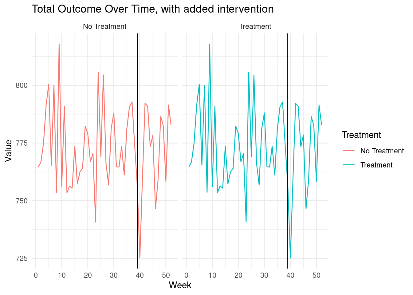
CausalImpact suggests the effect of our intervention is positive.
Let's examine the true change in the total outcome across all cities.
```{r}
total_outcome_treated_world <- treated_data %>% group_by(week) %>%
  summarize(total_outcome = sum(value)) %>% mutate(Treatment = 'Treatment')

total_outcome_untreated_world <- data %>% group_by(week) %>%
  summarize(total_outcome = sum(value)) %>% mutate(Treatment = 'No Treatment')


total_outcome <-
  bind_rows(total_outcome_treated_world, total_outcome_untreated_world)

ggplot(total_outcome, aes(x = week, y = total_outcome, color = Treatment)) +
  geom_line() +
  labs(x = "Week", y = "Value", title = "Total Outcome Over Time, with added intervention") +
  geom_vline(xintercept = 39, color = "black") +
  theme_minimal() +
  facet_wrap( ~ Treatment)
```
The treatment has a net total effect of zero, as we can see by comparing the
total outcomes in the data with and without the treatment effect added.
All the gains observed in the treated unit come at the expense of other
untreated units.
Yet, CausalImpact has no way of dealing with this and will erroneously suggest
our intervention had a positive effect.
## Conclusion
Bayesian structural time series models, as implemented in the CausalImpact
package, offer a powerful tool for businesses seeking to understand the impact
of their interventions. However, like all statistical methods, they come with
important caveats and assumptions that must be thoroughly understood and
validated.
The key to successful application lies in combining these sophisticated
statistical techniques with domain knowledge, careful data preparation, and a
healthy dose of skepticism. By doing so, businesses can gain valuable insights
into the effectiveness of their strategies and make more informed decisions in
an increasingly complex and data-driven world.
Remember, causality is not something that can be magically extracted from data
through algorithmic means. It emerges from our understanding of the world, our
theories about how things operate, and the assumptions we are willing to
embrace. Use these tools wisely, and they can illuminate the path forward. Use
them carelessly, and they may lead you astray.
::: {.callout-tip}
## Learn more
@brodersen2015inferring Inferring causal impact using Bayesian structural time-series models.
:::