---
title: "Beyond Normality"
share:
permalink: "https://book.martinez.fyi/beyond_normality.html"
description: "Business Data Science: What Does it Mean to Be Data-Driven?"
linkedin: true
email: true
mastodon: true
---
In the preceding chapters, we basked in the warm glow of normality, a
simplifying assumption that allowed us to model outcomes as if they arose from
the familiar bell curve. Yet, the real world often serves up data generated by
far more diverse processes. Outcomes might be binary choices (to adopt or
reject), rankings on an ordinal scale (like satisfaction surveys), or simple
counts (such as the number of subscribers). In this chapter, we embark on an
expedition beyond the comfortable confines of normality, charting the terrain of
these alternative data types and the specialized tools we need to analyze them.
## Binary Outcomes: The Coin Flips of Data
Binary outcomes are the coin flips of the data world – two sides, two
possibilities. Think success/failure, yes/no, or the ever-important adopt/reject
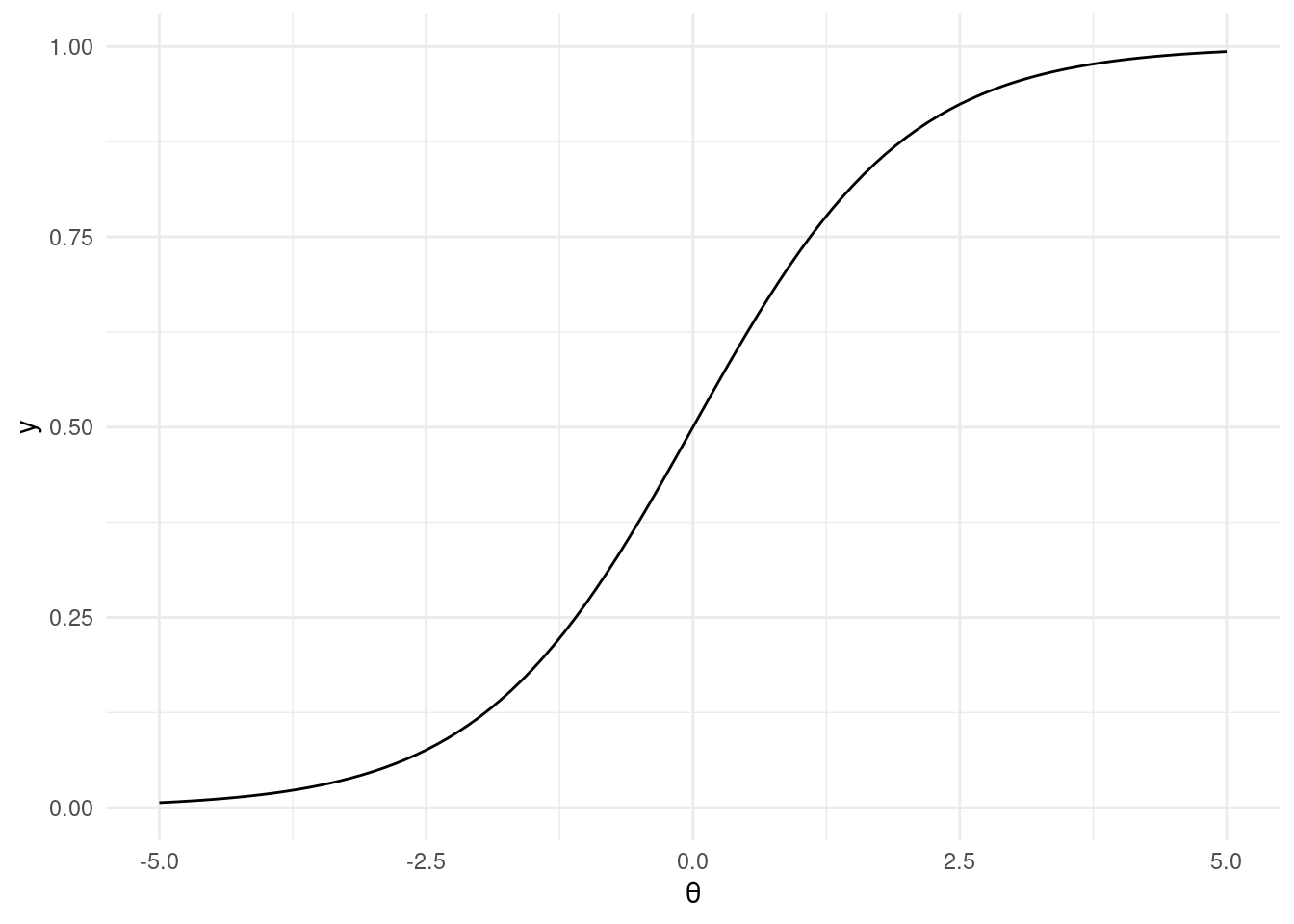
decision. To model these, we turn to the trusty logistic regression. While
linear probability models are also used, logistic regression has the distinct
advantage of keeping our predictions bounded between the sensible limits of 0
and 1.
This workhorse of a model is a type of generalized linear model, employing a
logit link function:
$$
\text{BernoulliLogit}(y|\theta) = \text{Bernoulli}(y|\text{logit}^{-1}(\theta))
$$
where
$$
\text{logit}^{-1}(\theta) = \frac{1}{1 + \exp(-\theta)}
$$
```{r inverse_logit, fig.align = 'center', message=FALSE, warning=FALSE}
library(ggplot2)
library(tibble)
library(dplyr)

inv_logit <- function(theta) {
  return(1 / (1 + exp(-theta)))
}

ggplot2::ggplot() +
  ggplot2::stat_function(fun = inv_logit) +
  ggplot2::theme_minimal() +
  ggplot2::xlim(-5, 5) +
  ggplot2::xlab(expression(theta))
```
To illustrate, let's cook up some fake data:
```{r fake_data}
# Fake data
N <- 2000
K <- 2
set.seed(1982)
fake_data <- tibble::tibble(
  x1 = rnorm(N, mean = 0, sd = 1),
  x2 = rnorm(N, mean = 0, sd = 1),
  treat = sample(
    x = c(TRUE, FALSE), size = N, replace = TRUE,
    prob = c(0.5, 0.5)
  ),
  r = runif(n = N, min = 0, max = 1)
) %>%
  dplyr::mutate(
    p0 = inv_logit(theta = -3 + 0.1 * x1 + 0.25 * x2),
    p1 = inv_logit(theta = -3 + 0.1 * x1 + 0.25 * x2 + 0.2),
    y0 = dplyr::case_when(p0 > r ~ 1, TRUE ~ 0),
    y1 = dplyr::case_when(p1 > r ~ 1, TRUE ~ 0),
    y = dplyr::case_when(
      treat ~ as.logical(y1),
      TRUE ~ as.logical(y0)
    )
  )
dplyr::glimpse(fake_data)
mean_y0 <- mean(fake_data$y0)
mean_y1 <- mean(fake_data$y1)
impact <- round((mean(fake_data$y1) - mean(fake_data$y0)) * 100, 2)
```
In this fabricated dataset, we've engineered a scenario where, without
intervention, only `r scales::percent(mean_y0)` would have adopted the feature.
Yet, with the intervention applied universally, adoption would have jumped to
`r scales::percent(mean_y1)`. The true impact of this intervention is a hefty
`r impact` percentage points.
### Prior predictive checking
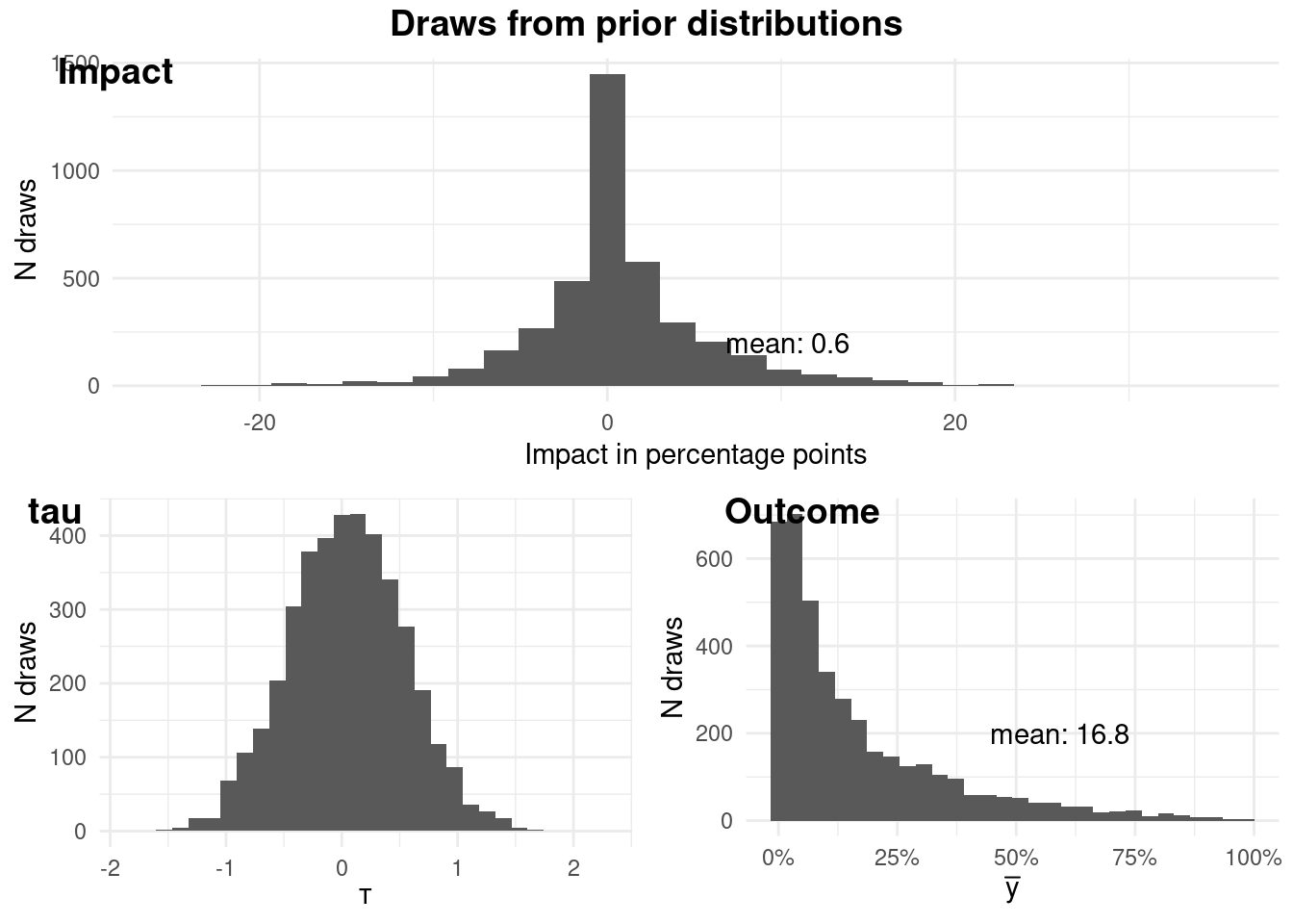
As Bayesians, we're not just number crunchers; we're storytellers. We weave
narratives about data, and our priors are the opening chapters. So, before we
unleash our model, let's ponder what our priors imply.
Our model takes this form:
$$
\begin{aligned}
\theta &= \alpha + X \beta + \tau T \\
\alpha &\sim N(\mu_{\alpha}, sd_{\alpha}) \\
\beta_j &\sim N(\mu_{\beta_j}, sd_{\beta_j}) \\
\tau &\sim N(\mu_{\tau}, sd_{\tau})
\end{aligned}
$$
```{r priors_check, fig.align = 'center', message=FALSE, results = "hide"}
logit <- imt::logit$new(
  data = fake_data,
  y = "y", # this will not be used
  treatment = "treat",
  x = c("x1", "x2"),
  mean_alpha = -3,
  sd_alpha = 2,
  mean_beta = c(0, 0),
  sd_beta = c(1, 1),
  tau_mean = 0.05,
  tau_sd = 0.5,
  fit = FALSE # we will not be fitting the model
)

logit$plotPrior()
```
### Fitting the Model: Where Theory Meets Data
Satisfied with our priors, we're ready to fit the model to the data:
```{r fit, fig.align = 'center', message=FALSE, results = "hide"}
logit <- imt::logit$new(
  data = fake_data,
  y = "y",
  treatment = "treat",
  x = c("x1", "x2"),
  mean_alpha = -3,
  sd_alpha = 2,
  mean_beta = c(0, 0),
  sd_beta = c(1, 1),
  tau_mean = 0.05,
  tau_sd = 0.5,
  fit = TRUE
)
```
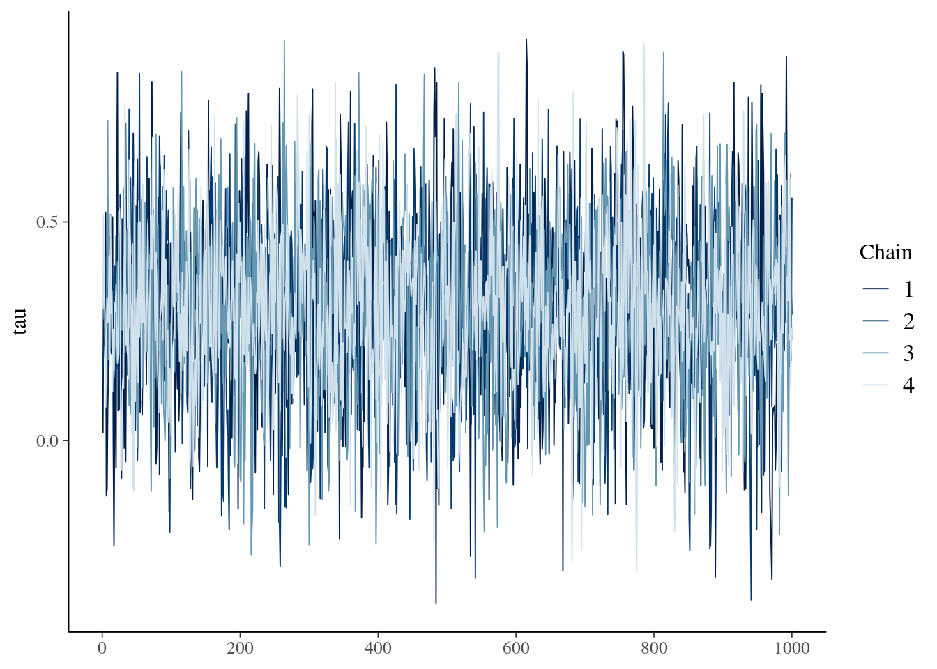
Let's glance at the trace plot of tau to ensure our chains mixed well and converged:
```{r tracePlot, fig.align = 'center'}
logit$tracePlot()
```
To sum up our findings, we have a few handy methods at our disposal:
```{r findings, fig.align = 'center'}
logit$pointEstimate()
logit$credibleInterval(width = 0.95)
logit$calcProb(a = 0)
```
We can also use the prediction function to predict new data and compare the
differences between groups. The `predict` function takes the `new_data` and
`name` argument to name the group. For example, here we will predict the data as
if all units are treated, then make another prediction as if all units are not
treated and summarize the two groups.
```{r predSummary}
fake_treated_data <- fake_data %>% mutate(treat = TRUE)
fake_control_data <- fake_data %>% mutate(treat = FALSE)
logit$predict(
  new_data = fake_treated_data,
  name = "y1"
)
logit$predict(
  new_data = fake_control_data,
  name = "y0"
)
logit$predSummary(name = "y1", width = 0.95, a = 0)
logit$predSummary(name = "y0", width = 0.95, a = 0)
```
We can also compare the differences between two groups of predictions.
```{r predCompare}
logit$predCompare(name1 = "y1", name2 = "y0", width = 0.95, a = 0)
```
We can also summarize and compare the predictions conditioning on subgroups.
```{r subgroup}
logit$predSummary(
  name = "y1",
  subgroup = (fake_data$x1 > 0),
  width = 0.95, a = 0
)
logit$predCompare(
  name1 = "y1",
  name2 = "y0",
  subgroup1 = (fake_treated_data$x1 > 0),
  subgroup2 = (fake_control_data$x1 > 0),
  width = 0.95, a = 0
)
```
Finally, we can get the posterior predictive draws for advanced analysis.
```{r getPred}
pred <- logit$getPred(name = "y1")
```
## Ordinal Outcomes
Ordinal outcomes are a rather curious beast in the realm of causal inference.
They have a natural order - think of a survey respondent rating their
satisfaction on a scale from "very dissatisfied" to "very satisfied" - but the
intervals between the values don't necessarily hold equal weight. The distance
between "dissatisfied" and "neutral" may not be the same as that between
"satisfied" and "very satisfied." This lack of equal spacing is a challenge we
must address head-on when analyzing the impact of an intervention or treatment.
This nuance of ordinal outcomes is also present in other domains, such as user
experience ratings (e.g., poor, fair, good, excellent), or educational
attainment levels (e.g., less than high school, high school diploma, some
college, college degree). In each case, there's a clear order, but the spacing
between levels is not uniform.
This lack of uniform spacing can complicate our analysis, particularly when
applying traditional regression models designed for continuous outcomes. We need
a tailored approach that respects the ordinal nature of the data, while still
allowing us to draw meaningful causal inferences.
TODO
## Count Outcomes {#sec-negative-binomial}
In this section, we're talking about events we can tally—website visits,
customer complaints, product sales, you name it. These outcomes are inherently
non-negative integers, reflecting the discrete nature of the events we're
counting.
The go-to tool for analyzing count outcomes is often Poisson regression.
However, real-world data frequently throws us a curveball in the form of
overdispersion, where the variance of the count data outstrips its mean. This is
where negative binomial regression swoops in to save the day. It's a souped-up
version of Poisson regression that accounts for overdispersion by adding an
extra parameter to the model.
Count data pops up in all sorts of scenarios. We might be interested in the
effect of a new marketing campaign on app downloads or the impact of a software
update on user logins. With count outcomes, the possibilities are as endless as
the events we can count.
### An Example with Fake Data: Video Views Galore
Let's say we're interested in the number of views a video receives in a given
period. This is a perfect opportunity to use the negative binomial distribution
to model the underlying data-generating process. Here's how we can express this:
$$
\begin{aligned}
y_i & \sim \text{NB}(\mu_i, \phi) \\
log(\mu_i) & = \alpha + X\beta
\end{aligned}
$$
In this model, $\mu$ represents the mean (which must be positive, hence the log
link function), and the inverse of $\phi$ controls the overdispersion. A small
$\phi$ means the negative binomial distribution significantly deviates from a
Poisson distribution, while a large $\phi$ brings it closer to a Poisson. This
becomes clear when we look at the variance:
$$
Var(y_i) \sim \mu_i + \frac{\mu_i^2}{\phi}
$$
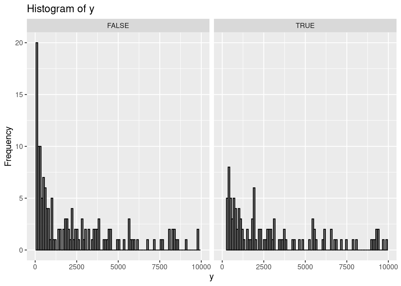
Let's whip up some fake data to illustrate:
```{r, message=FALSE, warning=FALSE}
set.seed(9782)
library(dplyr)
library(ggplot2)
N <- 1000

fake_data <-
  tibble::tibble(x1 = runif(N, 2, 9), x2 = rnorm(N, 0, 1)) %>%
  dplyr::mutate(
    mu = exp(0.5 + 1.7 * x1 + 4.2 * x2),
    y0 = rnbinom(N, size = 2, mu = mu), # here size is phi
    y1 = y0 * 1.05,
    t = sample(c(TRUE, FALSE), size = n(), replace = TRUE, prob = c(0.5, 0.5)),
    y = case_when(t ~ as.integer(y1),
      .default = as.integer(y0)
    )
  ) %>%
  filter(y > 0)

# Plotting the histogram using ggplot2
ggplot(fake_data, aes(x = y)) +
  geom_histogram(
    bins = 100,
    color = "black",
    alpha = 0.7
  ) +
  facet_wrap(~t) +
  labs(title = "Histogram of y", x = "y", y = "Frequency") +
  xlim(0, 1e4) +
  ylim(0, 20)
```
### OLS: A Common, But Flawed, Approach
A typical way to estimate the lift of an intervention in this scenario is to run
ordinary least squares (OLS) on the natural logarithm of the outcome. Then,
folks often look at the point estimate and 95% confidence interval for the
treatment effect. Doing this with our fake data might lead you to conclude that
the intervention is ineffective, as the 95% confidence interval includes zero.
```{r}
lm(data = fake_data, log(y) ~ x1 + x2 + t) %>% broom::tidy(conf.int = TRUE)
```
### Taming Overdispersion: The Bayesian Negative Binomial Advantage
Enter the Bayesian negative binomial model, easily implemented using the {imt}
package in R. This approach has two key advantages. First, it better captures
the true data-generating process. Second, being Bayesian, it lets us incorporate
prior information and express our findings in a way that's more directly
relevant to business decisions.
```{r NB, message=FALSE, results = "hide"}
library(imt)
nb <- negativeBinomial$new(
  data = fake_data, y = "y", x = c("x1", "x2"),
  treatment = "t", tau_mean = 0.0, tau_sd = 0.025
)
```
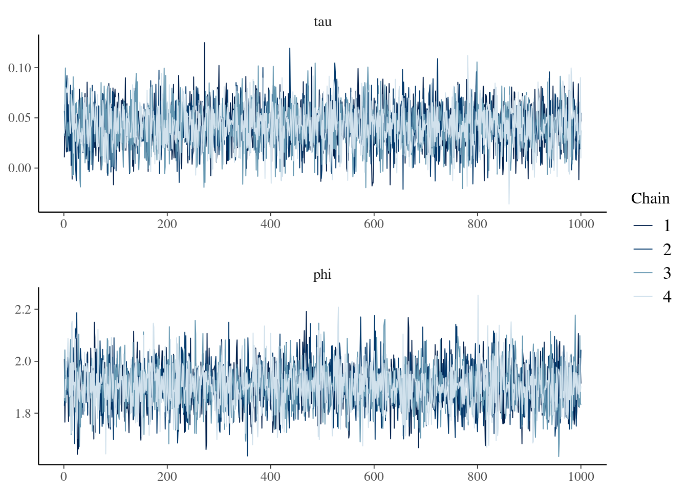
A quick check of the trace plot is always a good idea:
```{r tp}
nb$tracePlot()
```
Now for the payoff. We can readily obtain a point estimate for the impact using
`nb$pointEstimate()` (`r scales::percent(nb$pointEstimate())`) and a 95%
credible interval using `nb$credibleInterval(width = 0.95, round = 2)`
(`r nb$credibleInterval(width
= 0.95, round = 2)`). But what if we want to know
the probability that the impact is at least 1% (or any other threshold)? Easy
peasy! We use `nb$posteriorProb(threshold = 0.01)`
(`r nb$posteriorProb(threshold = 0.01)`). Finally, to visualize the evolution of
our understanding from prior to posterior, we employ `nb$vizdraws()`.
::: {.content-visible when-format="html"}
```{r vz, message=FALSE}
#| eval: !expr knitr::is_html_output()
nb$vizdraws(display_mode_name = TRUE, breaks = 0.01,
            break_names = c("< 0.01", "> 0.01"))
```
:::